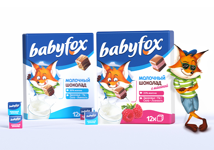
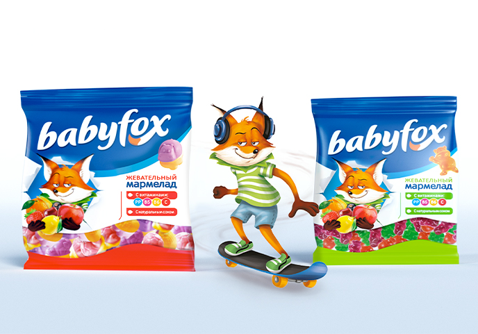
The first need was to create a brand system that would be clear and recognizable even across products sold in different segments and shelves.
Hence the division into three areas: the logo at the top, a colored band at the bottom - differencing the flavors - and a central band, where most of the information is located. Here, on the left, a friendly character plays with the product, relating to children and creating an immediate emotional bond. On the right hand side is the communication aimed at parents, with the product descriptor, its nutritional characteristics and pluses (such as the presence of vitamins or fruit juice). Everything is presented in a very clear and informative way on a white background - the color of simplicity and reassurance.
The design positions Babyfox as a tasty product that also provides the right nutrients for growth. Simply said: eat foxy, grow foxy!
