Aproject that involves all the main touchpoints of the brand: it’s Bibanesi, the iconic mini chunky breadsticks created in 1987 by Giuseppe Da Re. A story of family, creativity, Italian know-how that we have translated in a simple, genuine and unmistakable brand language.
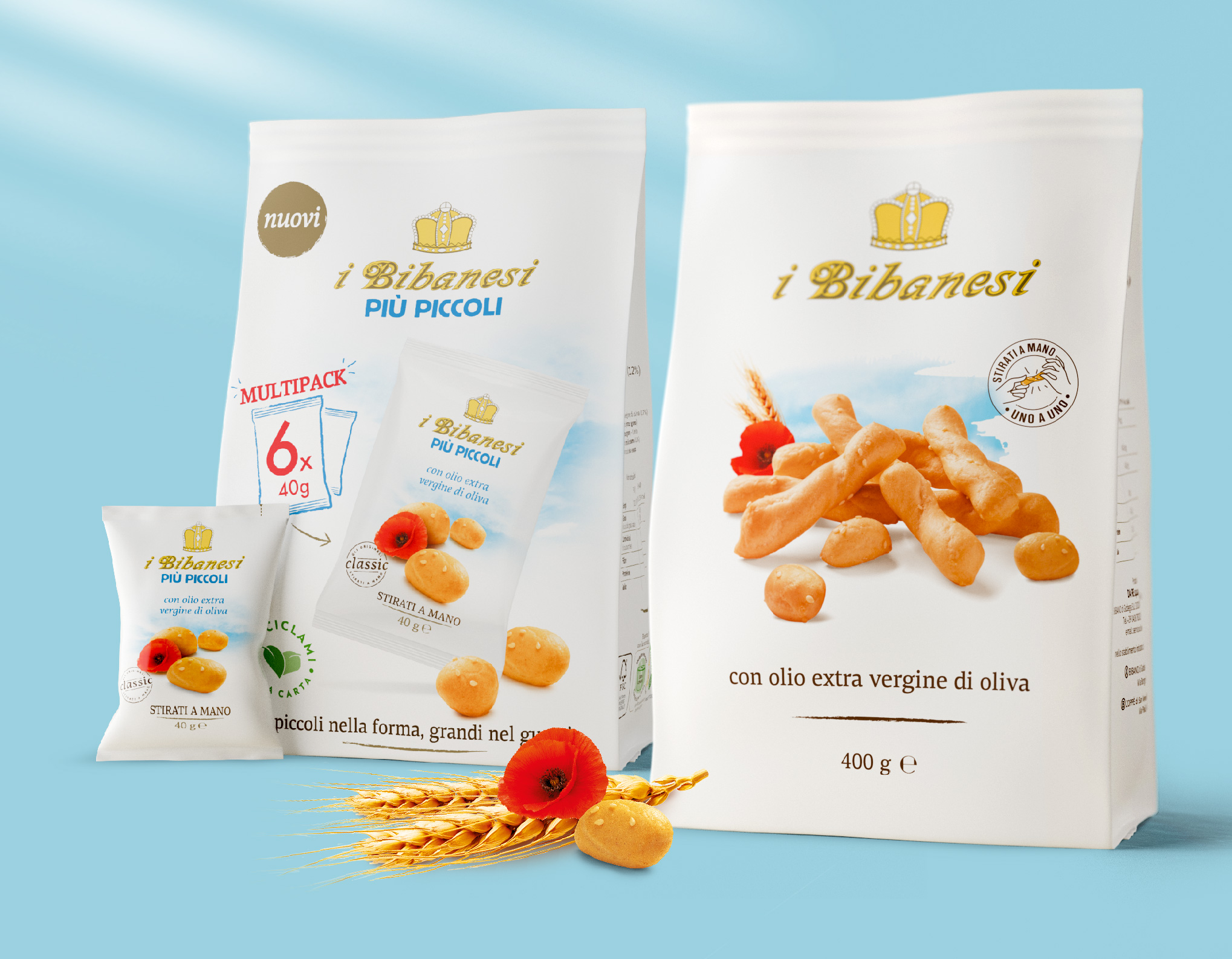
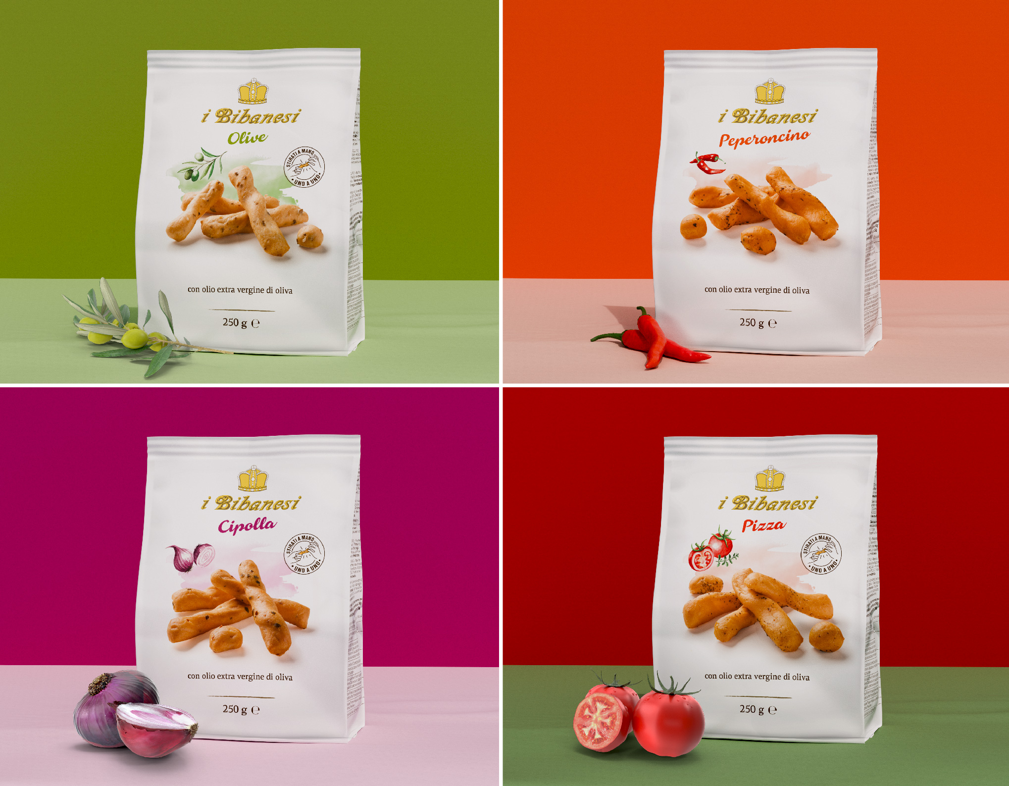
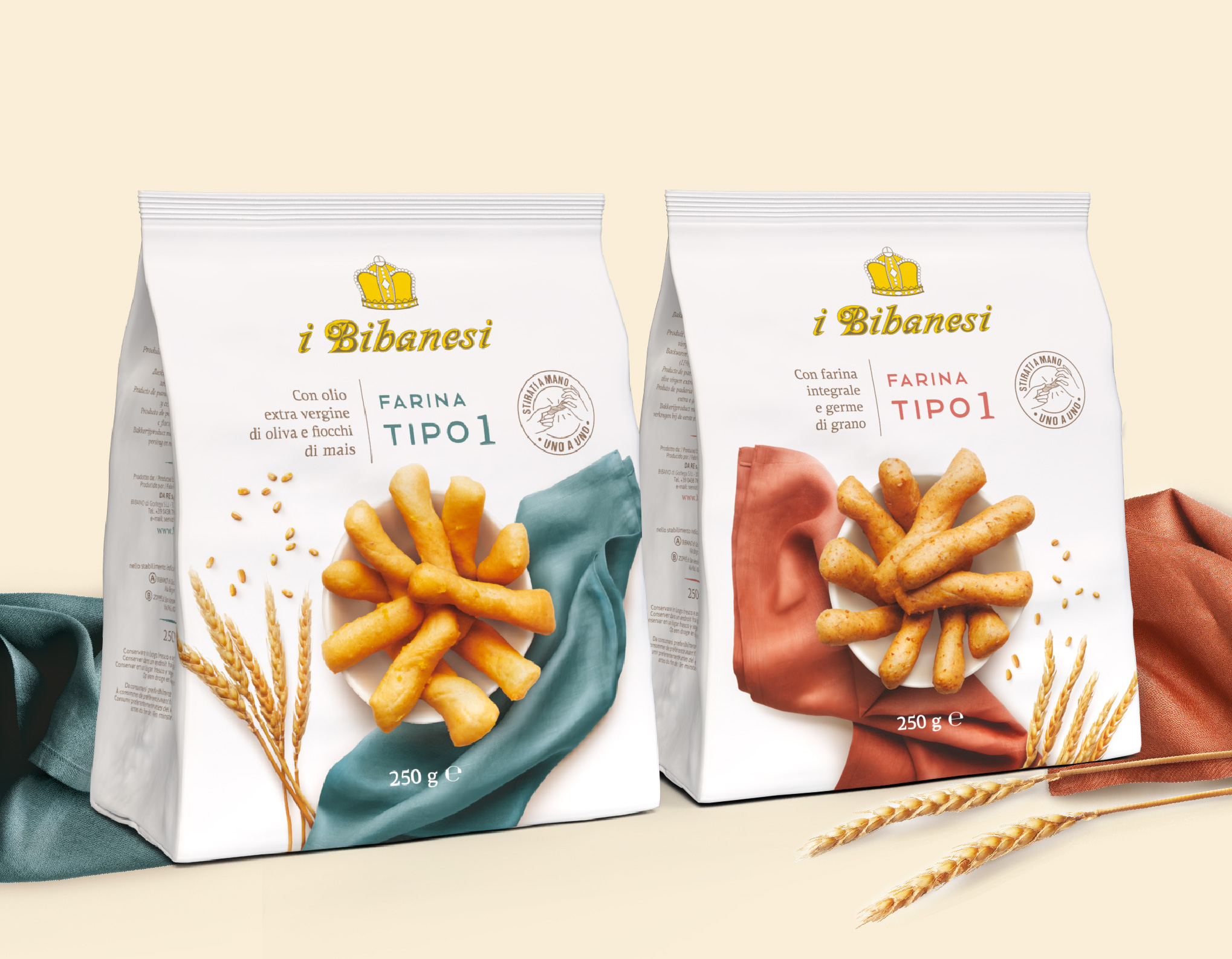
It all started with the packaging, a true icon of the brand: a unique and distinctive identity, characterized by white, with the personal logo chosen by the founder and the breadsticks key visual, simply associated with the naturalness of the wheat under the blue summer sky. At first, our challenge was to update such an authentic story for the launch of a new product – the Bibanesi “più piccoli” (the smallest Bibanesi): we had to balance respect and enthusiasm, innovation and care for the visual heritage of the brand. Then followed the Mediterranean line, characterized by hand-made watercolors (the Bibanesi have always been in love with art and graphic illustration); the "special grains" line, which translates each type of cereal into a specific composition of breadsticks, surrounded by wildflowers and painted ears; the “Type 1”, with a more rustic dough, with unrefined flour.
Packaging as unique as the breadsticks they contain: all similar, but different from each other, because they are handmade one by one.
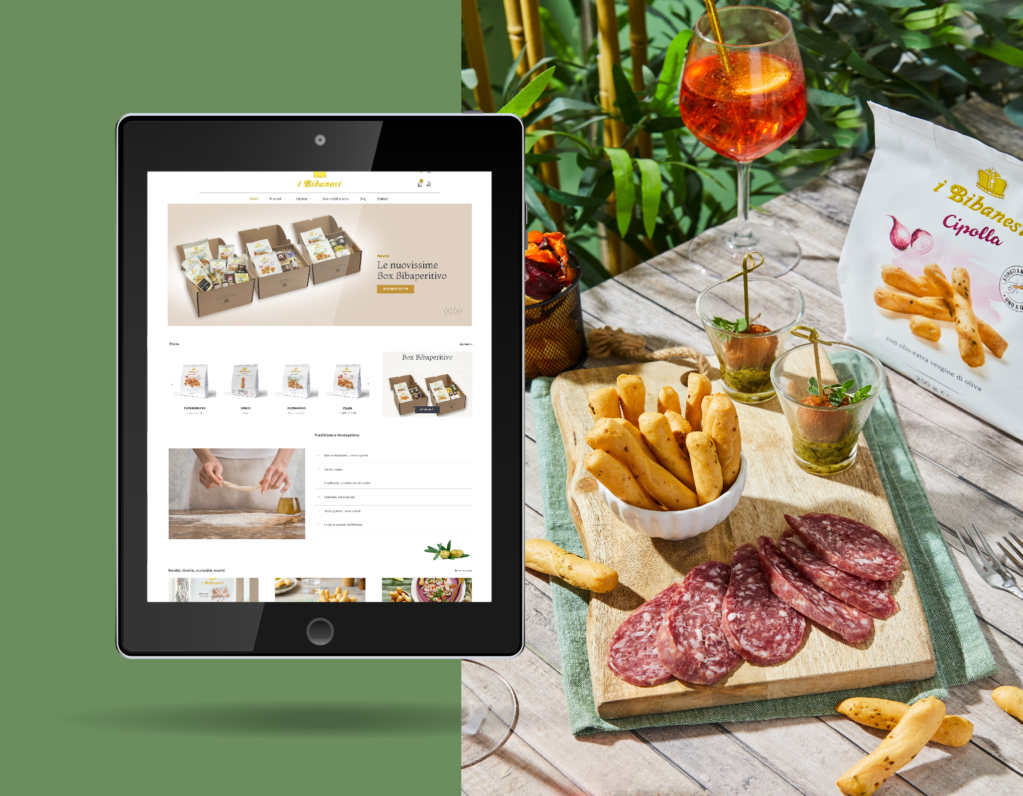
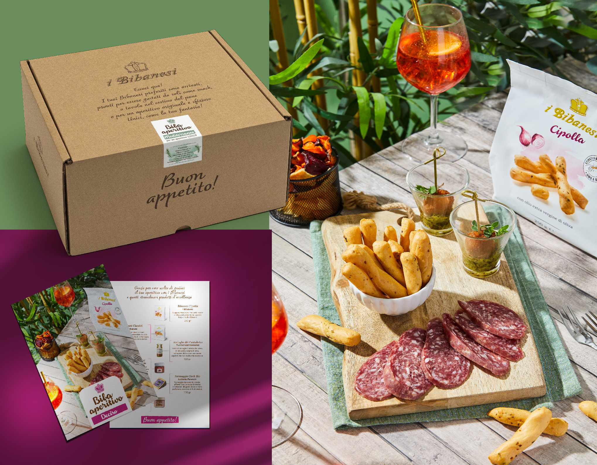
In the meantime, the Bibanesi have landed online with a website redesigned to give a new impulse to e-commerce – always with the clarity and simplicity of the “Da Re-style”. A dedicated brand activation was an opportunity not to miss: the Bibaboxes, exclusive packages for gifting or self-consumption, with chunky breadsticks combined with gastronomic specialties for an original Italian aperitif - sold only on the web, along with the merchandising dedicated to the Mediterranean line.
And how can we leave out the traditional point of sale? In-store activations, sampling and promotions required the creation of materials such as promo desks, posters, shopping bags... Finally the corporate and sell-in projects: from the stand to the product catalogue, all communication supports were coordinated, according to the marketing strategy, to convey the brand values and product benefits with consistency and fresh creativity.
The result is a brand language that is striking for its immediacy and simplicity, lightness and substance, thanks to a design that was capable to capture the true soul of the Bibanesi.


