Ohe Calvé brand needs no introduction. It was born in France at the end of the 19th century and since then it has never stopped enriching the dishes of millions of consumers with mayonnaise, sauces, dressings and peanut butter.


Ohe Calvé brand needs no introduction. It was born in France at the end of the 19th century and since then it has never stopped enriching the dishes of millions of consumers with mayonnaise, sauces, dressings and peanut butter.
Today, the brand is launching a new line for Eastern Europe of particularly thick and tasty sauces. With it comes the need for a packaging that can communicate the appeal of the new products.
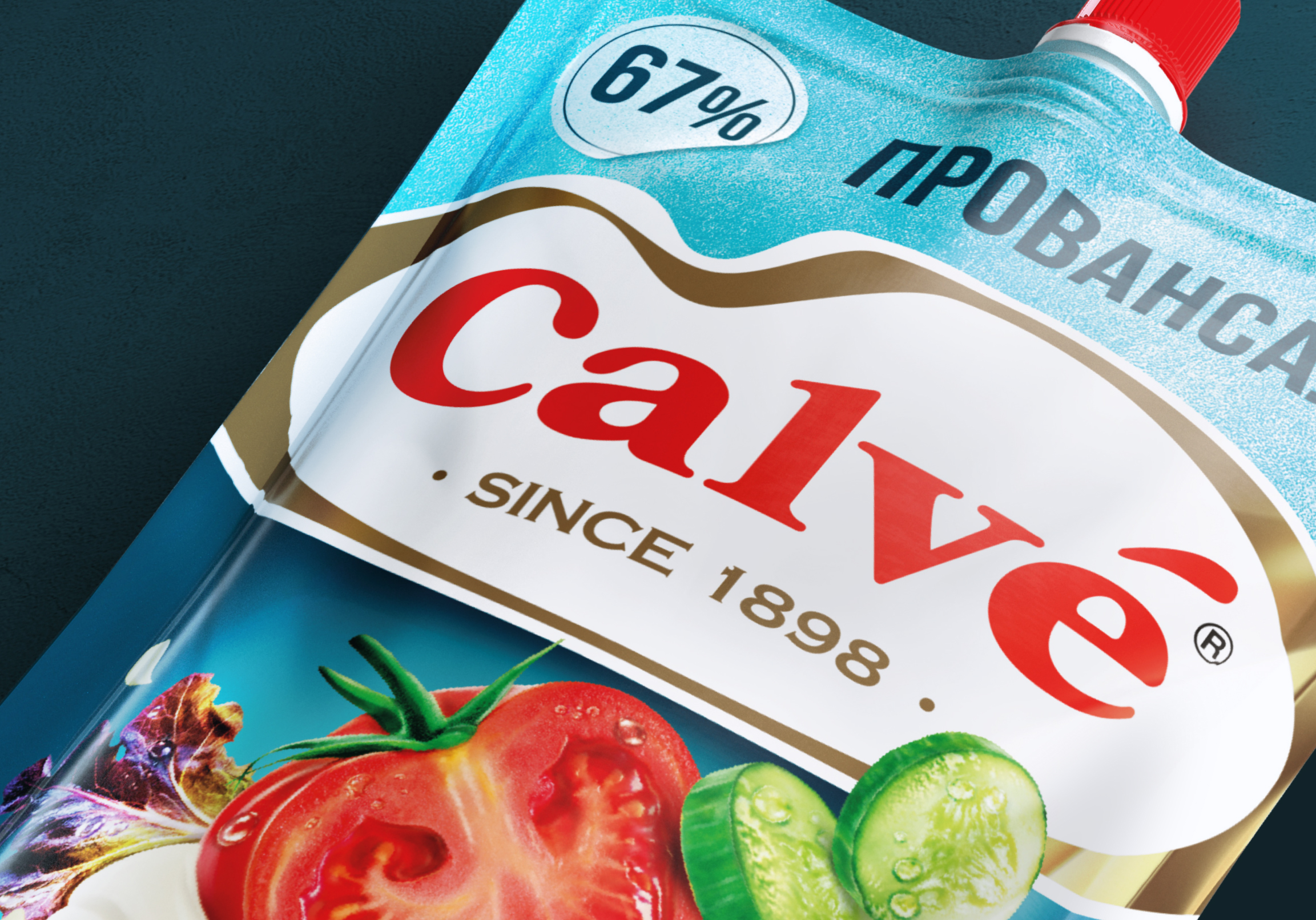
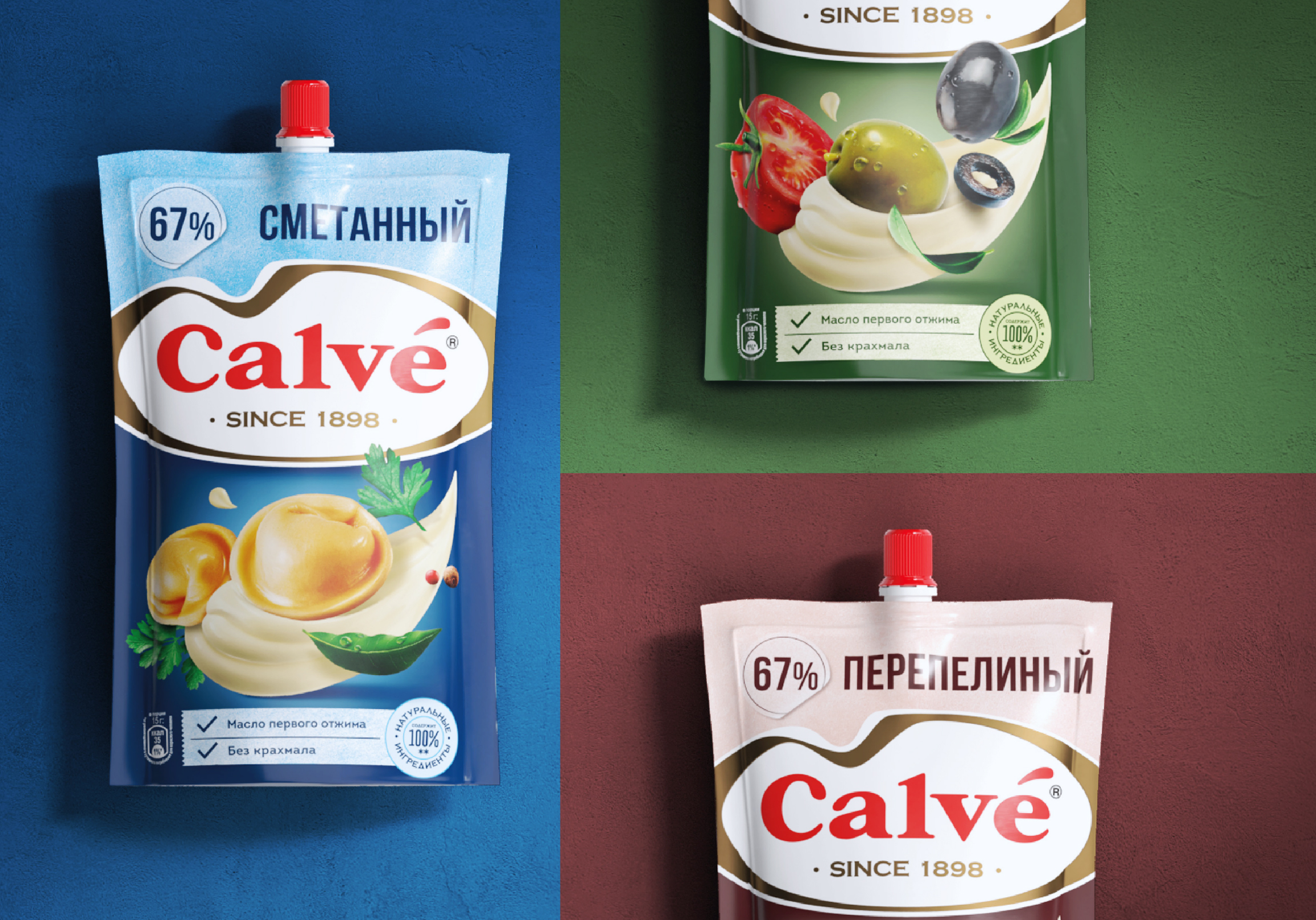
Relying on the strong iconicity of the brand, much importance was given to the logo. It was a way to both exploit its recognizability and to communicate how the new line best interpreted the characteristics of creaminess and tastiness, historical assets of the brand.
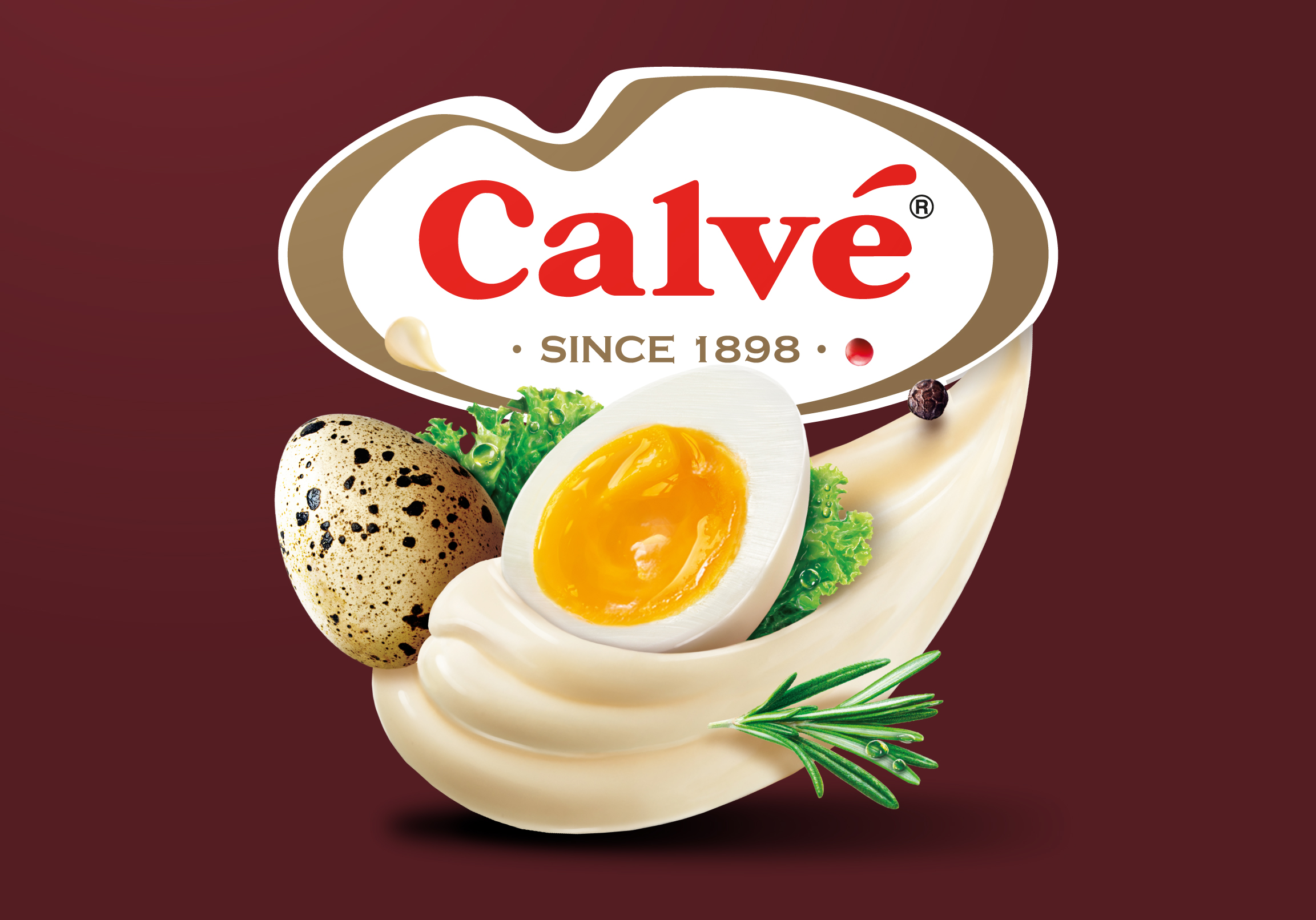
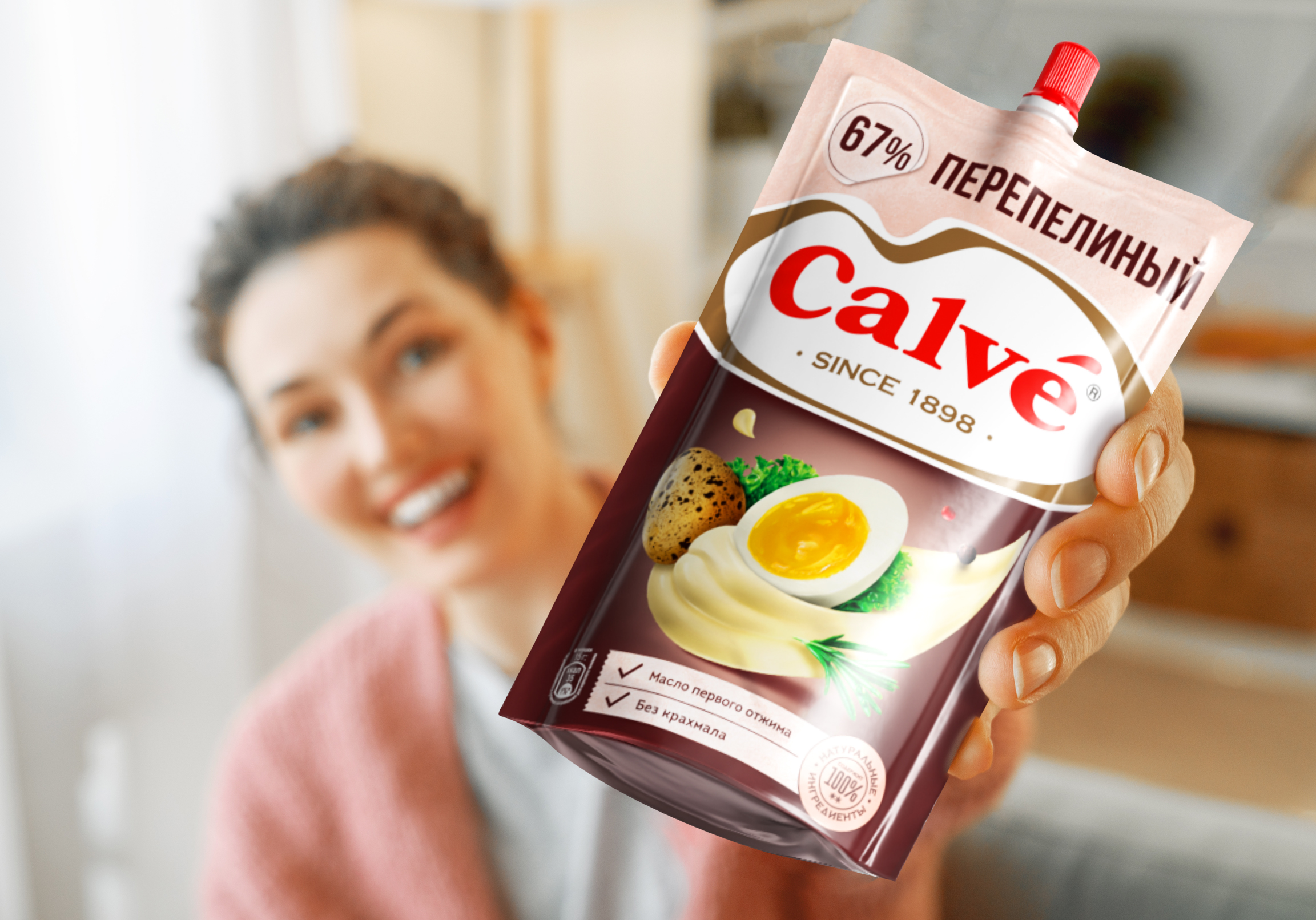
A lot of space has been also given to the product visual. The image is impactful, and has a strong appetizing appeal (which has been greatly increased over that of the classic line).
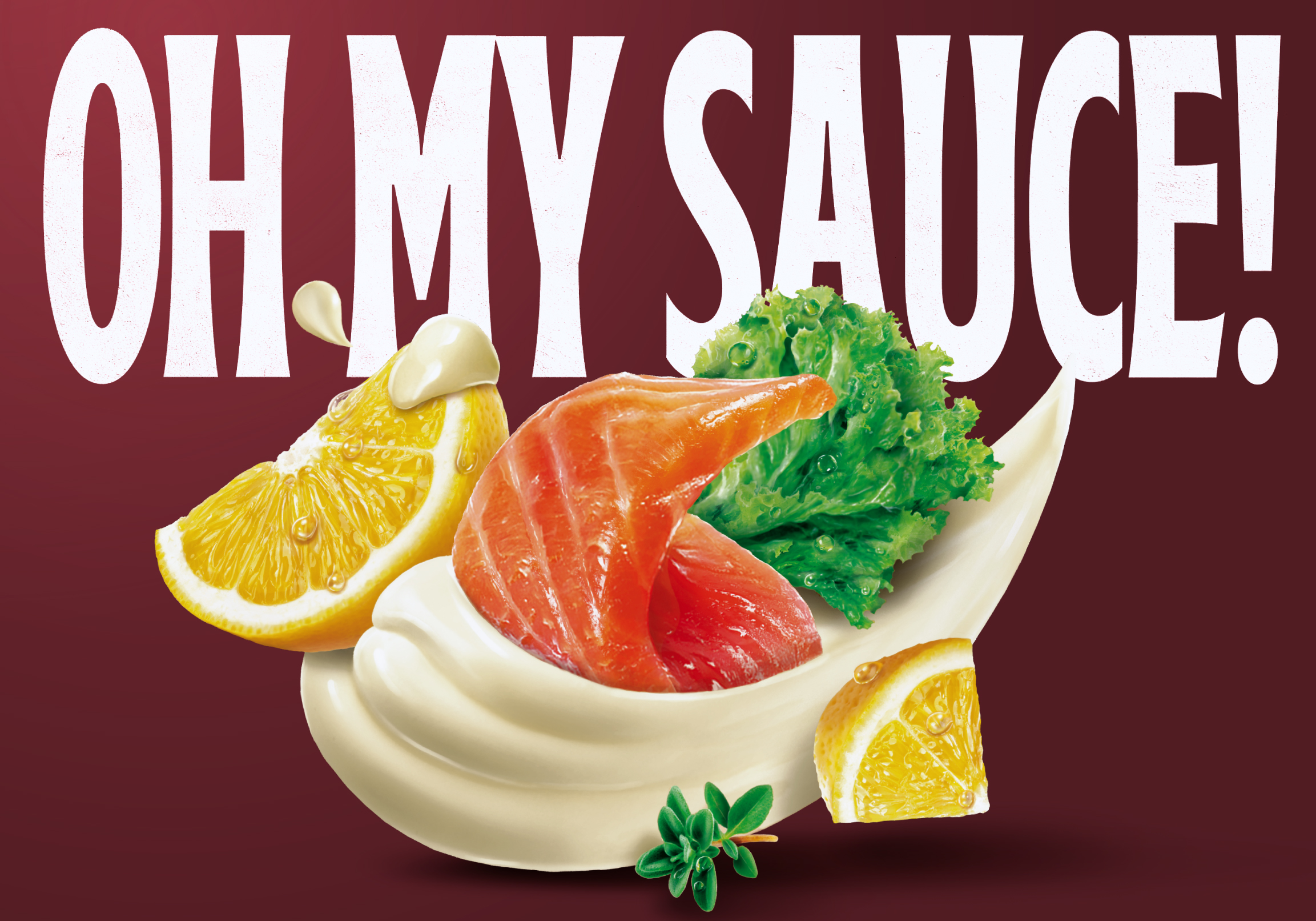
The product descriptor, placed above the logo, leaves the central space free precisely to allow the visual to become the beating heart of the communication.
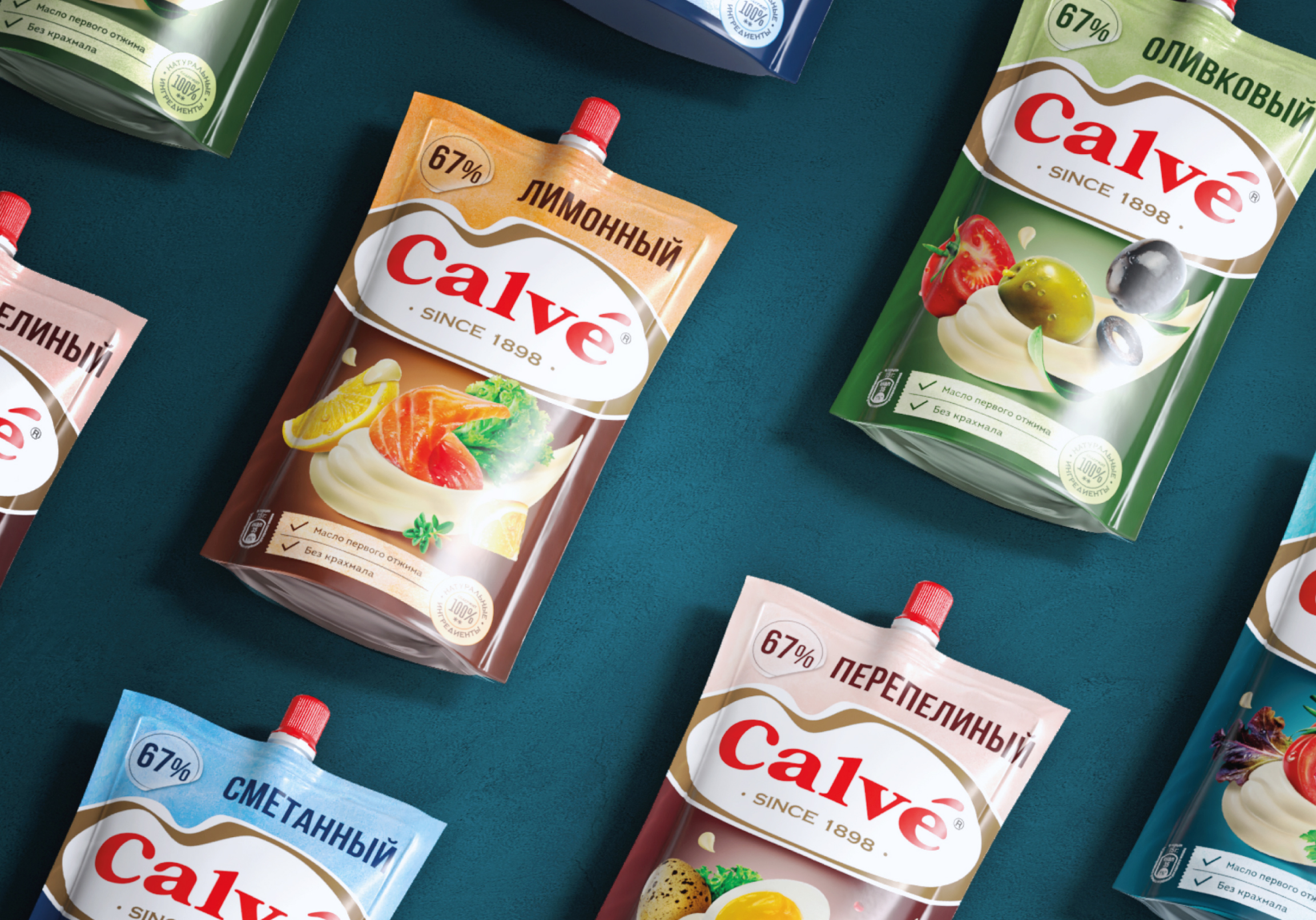
Following the same principle, the product pluses are rationalized and positioned in a dedicated space at the bottom of the pack.
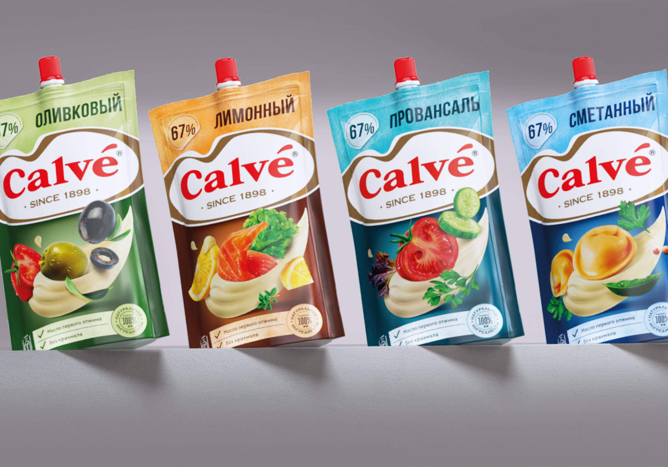
It’s impossible to look at the new sauces without trying them!
Necessary cookies are absolutely essential for the website to function properly. This category only includes cookies that ensures basic functionalities and security features of the website. These cookies do not store any personal information.
Any cookies that may not be particularly necessary for the website to function and is used specifically to collect user personal data via analytics, ads, other embedded contents are termed as non-necessary cookies. It is mandatory to procure user consent prior to running these cookies on your website.
