Close

Cuore di Natura

/ / Sectors / Food / Cuore di Natura
 

SCENARIO

Wuore di Natura appears for the first time on the market in 2016. It’s a baby food brand and its products are additive-free and prepared with biological ingredients only. The range of flavours offered by Cuore di Natura matches the most recent culinary trends. Despite the brand debuts in a growing market, its target audience (consumers of biological products) are somehow sceptical toward processed baby food.

THE TASK

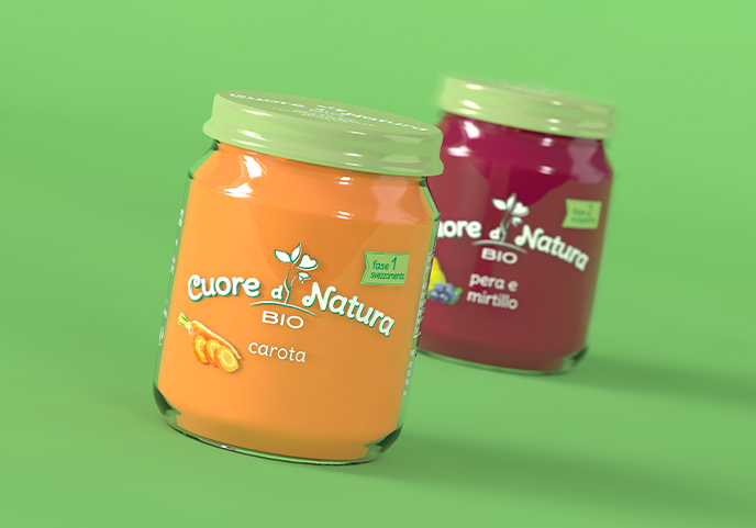
It was necessary to create a logo and a packaging for Cuore di Natura, defining a brand voice that would be able to win consumer’s trust and hearts.

DESIGN SOLUTION

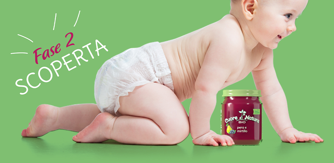
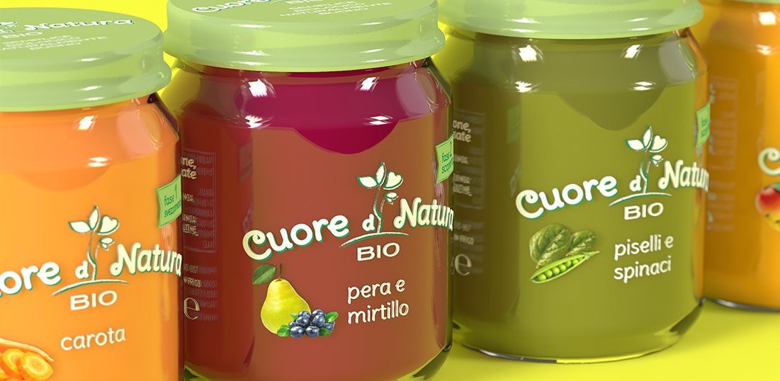
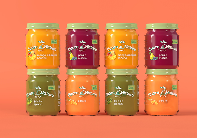
The tone of voice has to be direct, true and essential to convey the natural essence of the product and the brand’s commitment toward transparency. At the same time the brand should be able to talk with a nuance of tenderness to address mothers’ love: the logo is then formed by a sprout (nature) from which a little heart stems (love). Transparency toward consumers is communicated by the essential design of the glass jar, letting us see as much as possible of what is inside. An authentic and direct language is also achieved in suggesting when the product is supposed to be consumed: instead of indicating the age of the child in months, we preferred a more concrete and down to heart indication of real life moments such as “weaning” and “discovery”.

0