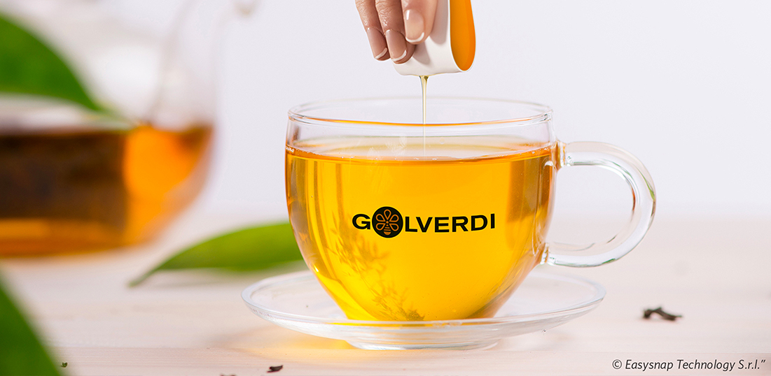
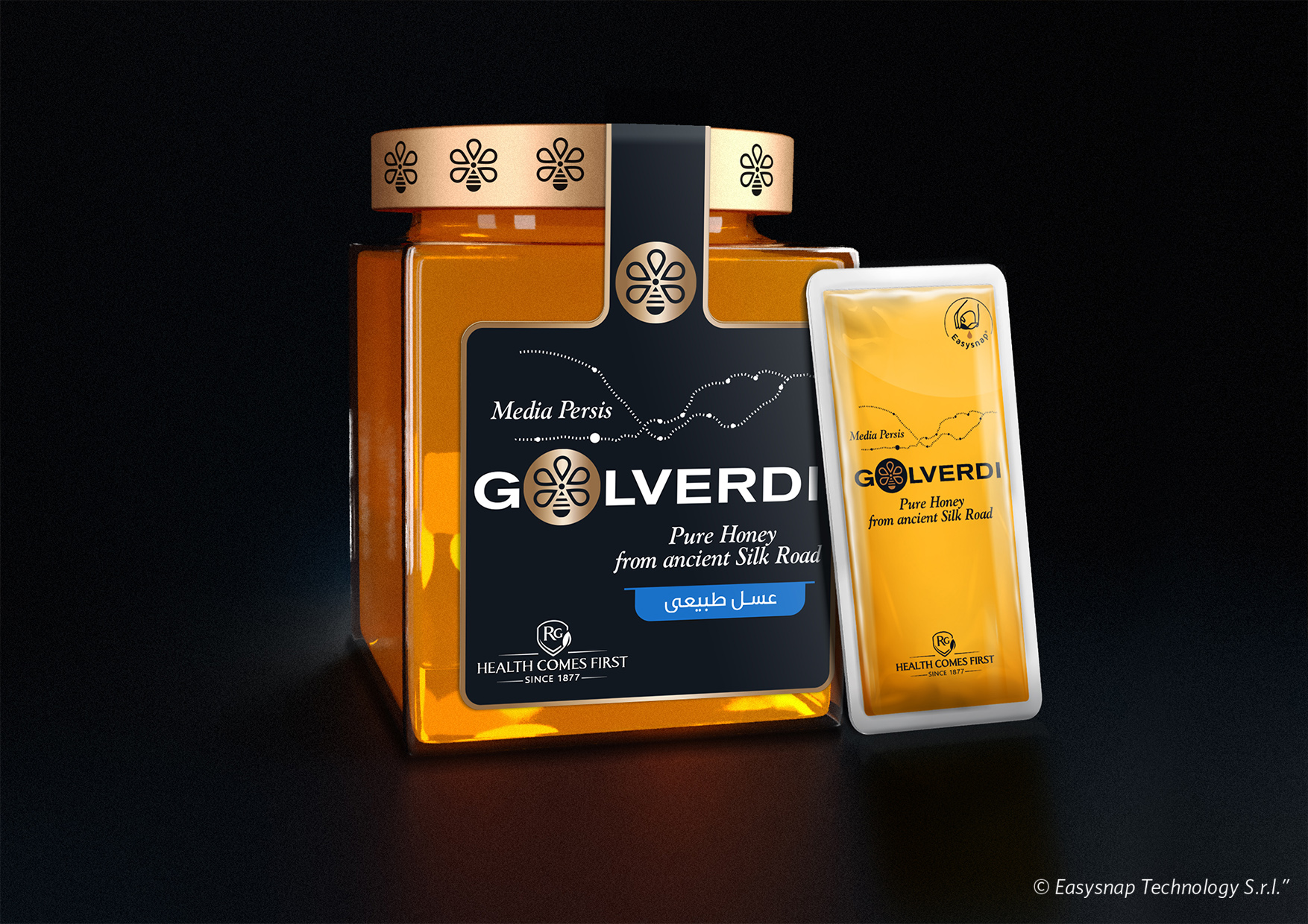
Golverdi, from Farsi “Gift from a flower”, aims to consider our honey as a gift from Nature.
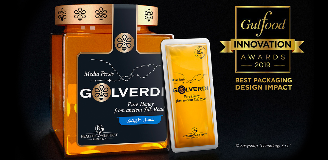
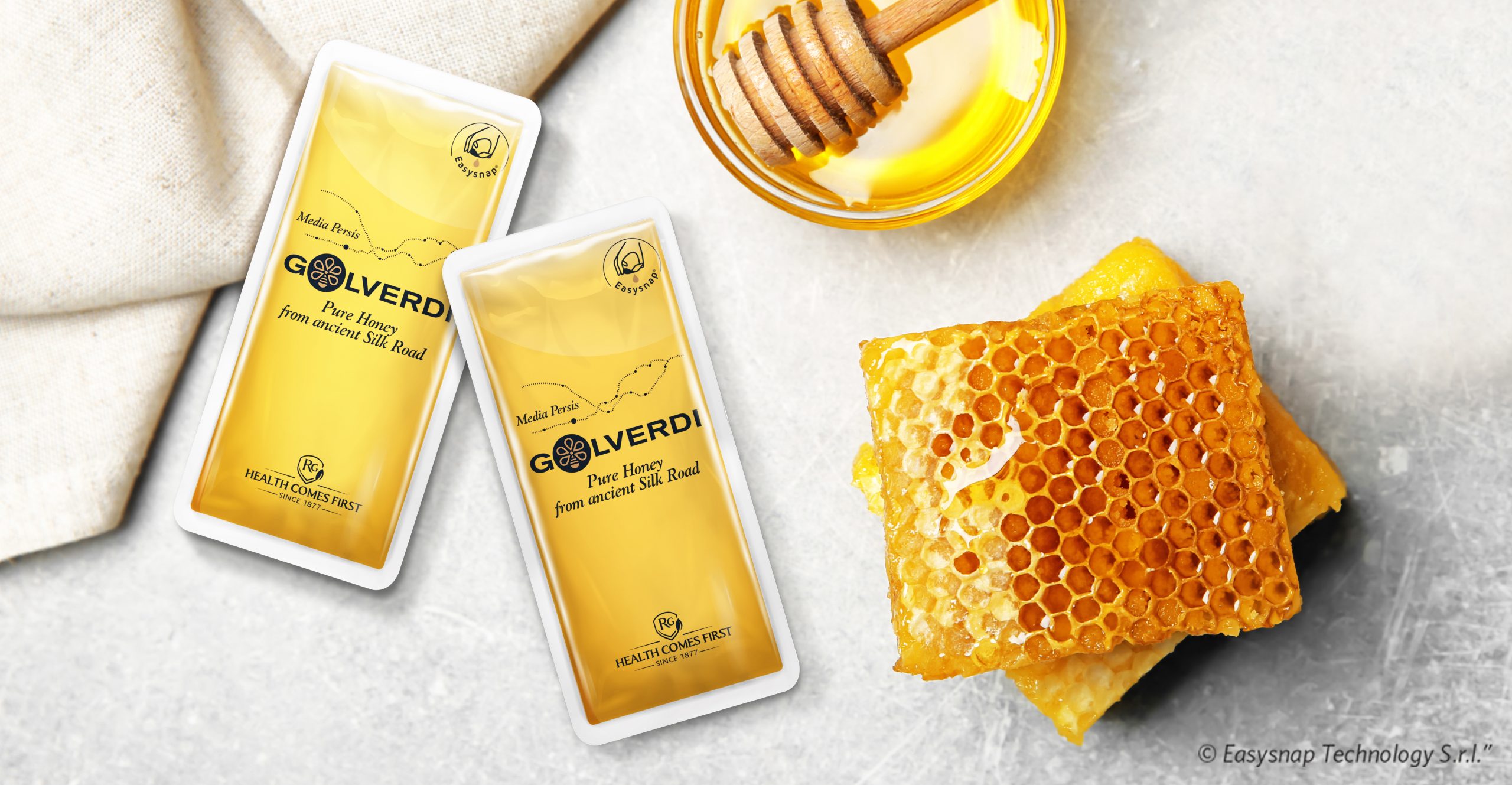
The design is modern, premium and pure with an iconic symbol that originates from the union of a bee and a flower. The chosen font regards the purpose of creating a modern look&feel. A clear reference to the origin land of the honey is in the silk road map and the payoff “Pure honey from ancient soil road”. The packaging aims to convey the message of purity of the product, through its transparency.
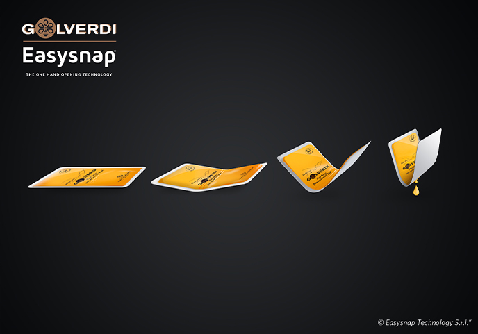
A particular attention must be on the packaging: it has been done a deep research in order to put on the market a traditional product, on a very innovative packaging, with a patent on the technology of Easysnap, conveying an added value to the product.
Finally, on each pack it’s present a QR code, linking the consumer to a direct internet page that permits to trace the product and its origin.
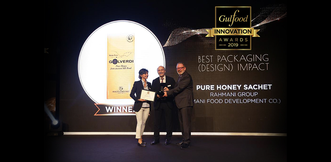
UPDATE: Golverdi (Rahmani Group) with Easysnap wins the Gulfood innovation Award 2019 for the BEST PACKAGING DESIGN IMPACT!
