Who says a sweet snack can't be both natural and delicious?
Good for you, is the new motto of My Motto, a brand of crispy wafers born in 2018. Its communication codes differ from those of the category and were developed to appeal to a young target audience as 'the mouth-watering, unconventional snack'.
Years later, and on the of surge of its success at global level, the brand has decided to interpret the market's evolving needs by selecting more genuine ingredients and repositioning itself as the “good for you” yet mouth-watering snack, a rewarding yet guilt-free experience.
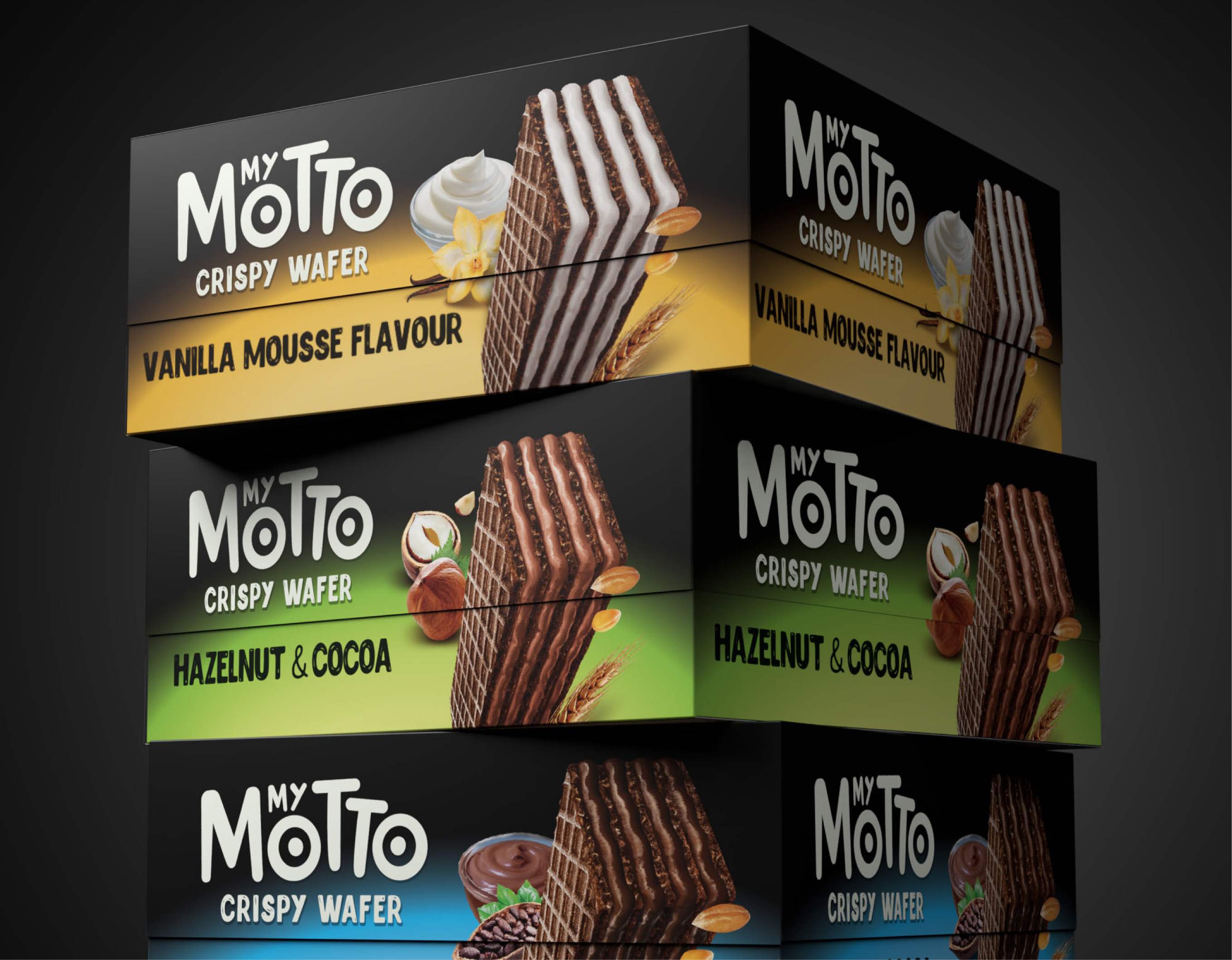
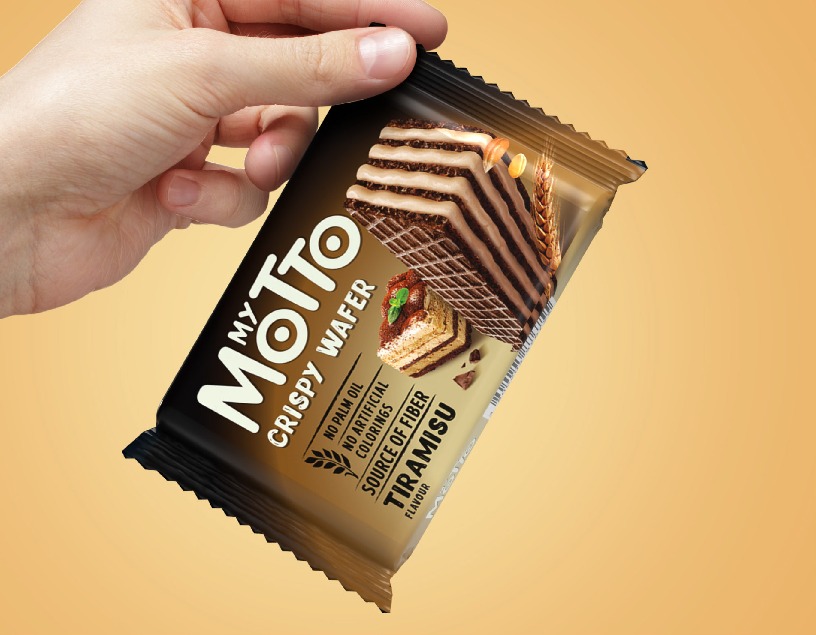
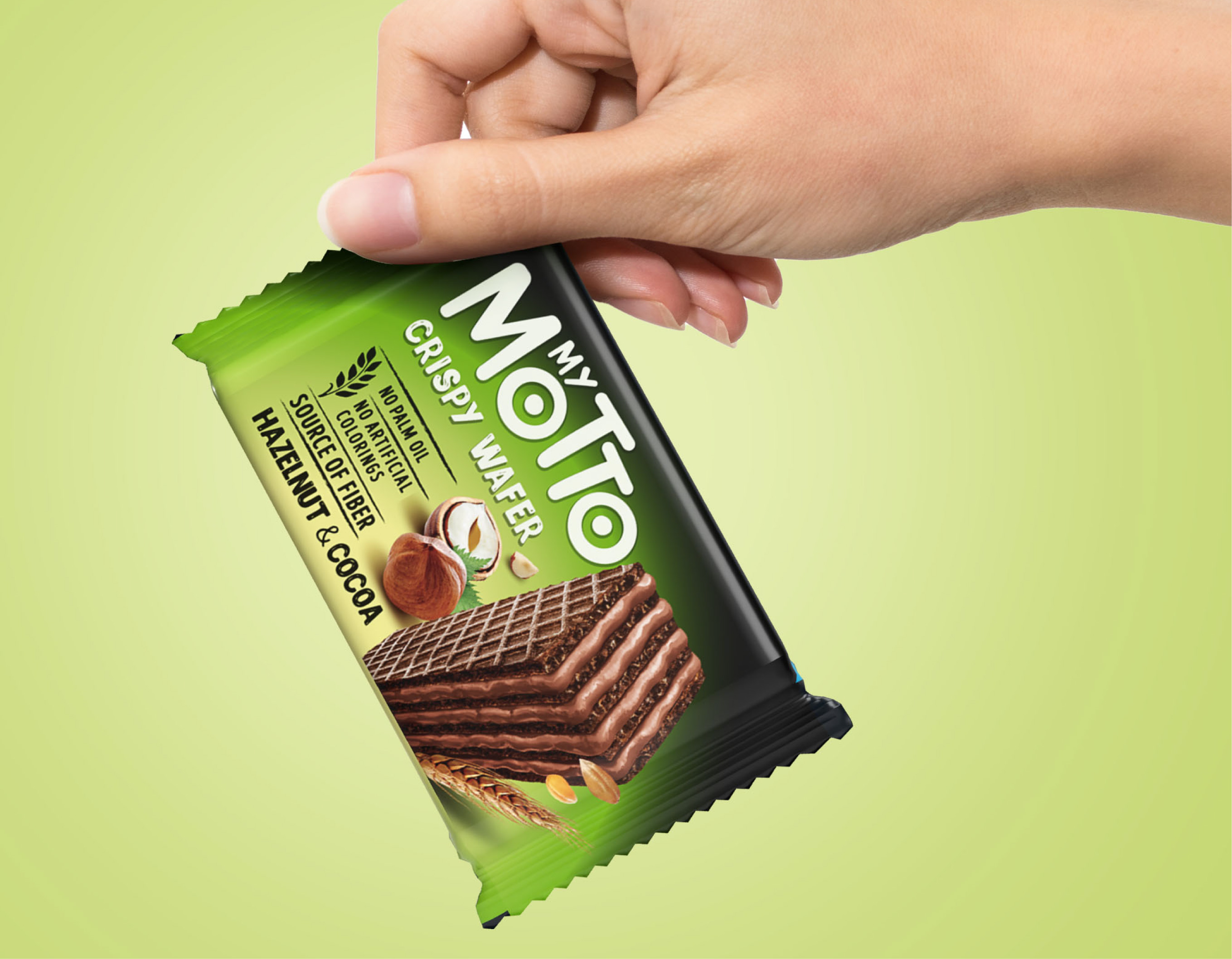
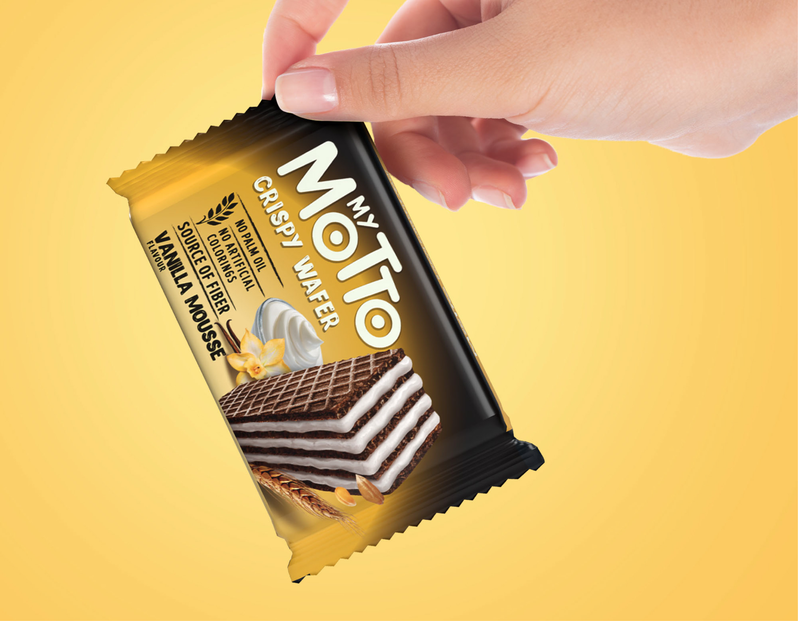
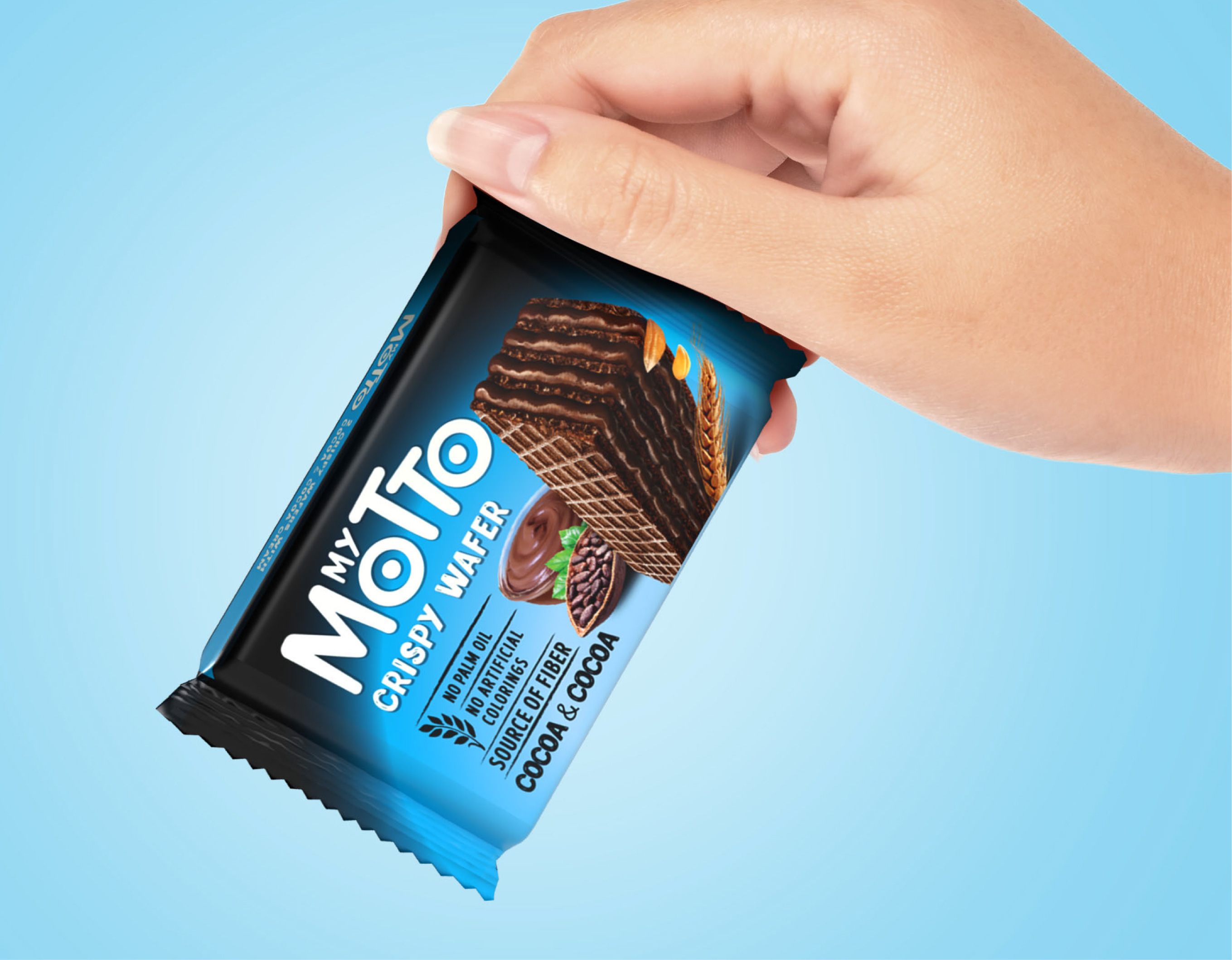
Break created a new packaging design that reflected the brand's new philosophy, striking a delicate balance between recognizability and novelty. More than just a cosmetic update, it was a strategic brand repositioning.
The first step was taken with the visual, which remains absolutely mouth-watering and creamy, yet more realistic and natural. Black identifies the brand very well but does not communicate authenticity, so it has been limited to the brand area, leaving plenty of room for the flavor color codes.
A claim system conveying all natural pluses was added, and the logo became simpler, with more balanced weights between the two words. Finally, the category name 'Crispy Wafer' was added, clear and visible, claiming a genuine yet mouth-watering snack.
