Close

HELLO DAY


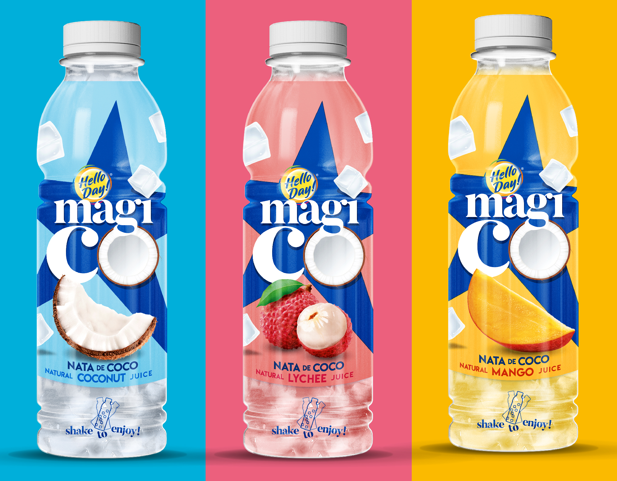
The innovative nature of the product and its mix of solid and liquid, eating and drinking, posed a communication challenge. Yet, the solution was simple. Instead of focusing the main message on the physical features of the product, we pointed to the benefit and the magic consumer experience it delivers.

Consumers of the indulgence category are constantly searching for new types of delights. Agus has found the answer with a new beverage innovation, which is an intriguing combination of liquid juice and jelly coconut cubes (nata de coco). The complex structure brings a new pleasure, and consumers get the feeling of being magically teleported to exotic places. For the first time, a new quality of indulgence has entered the beverage sector.


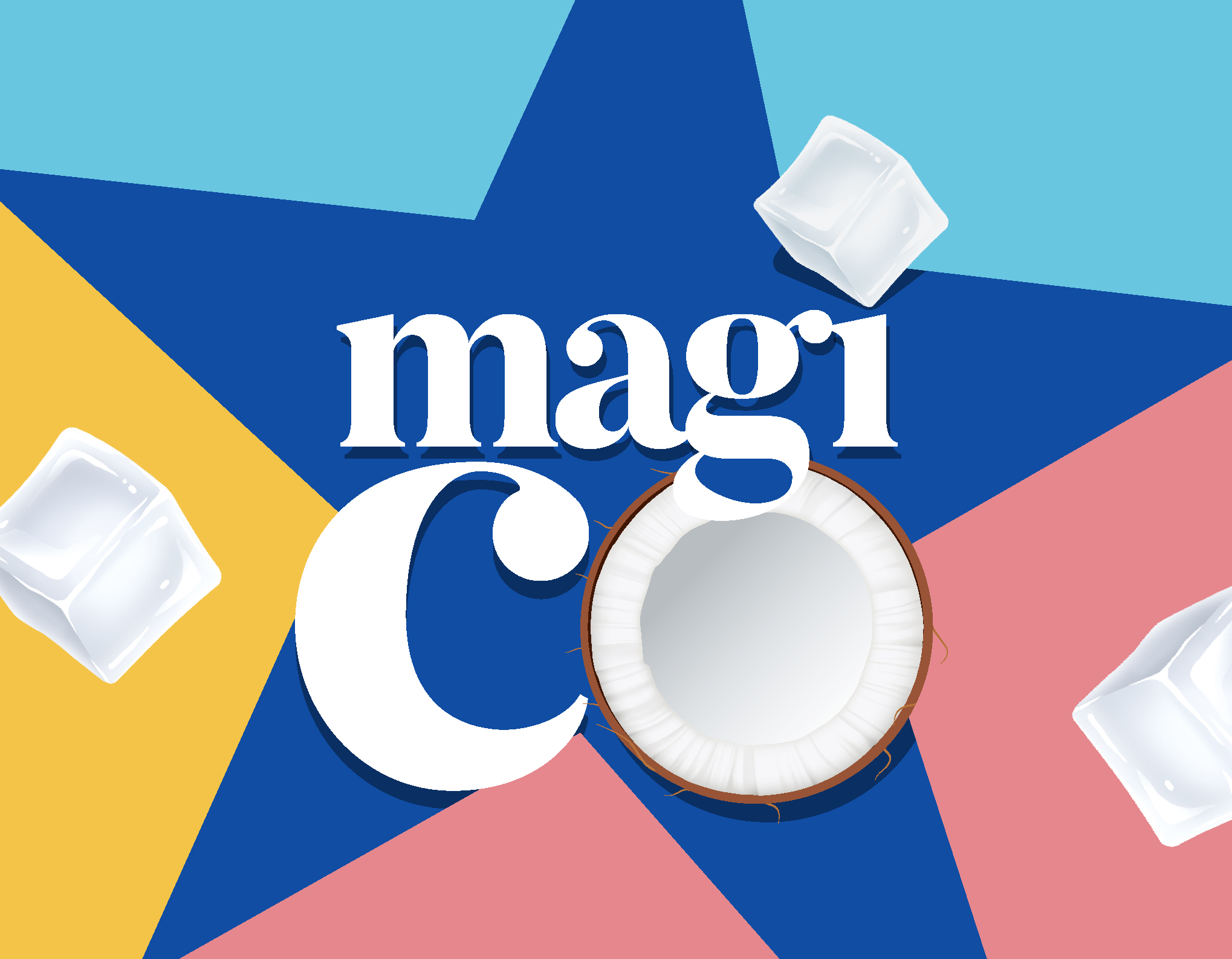
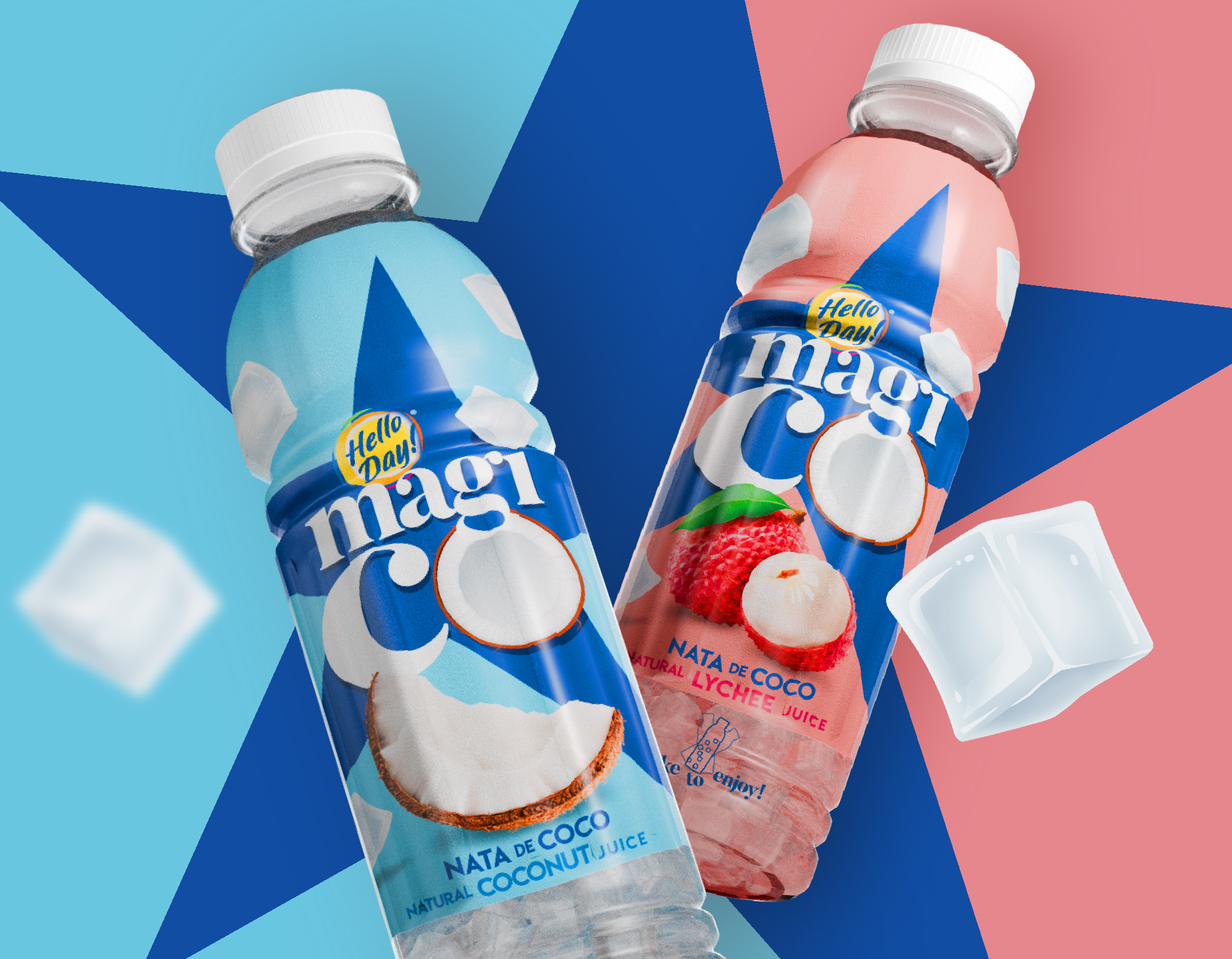
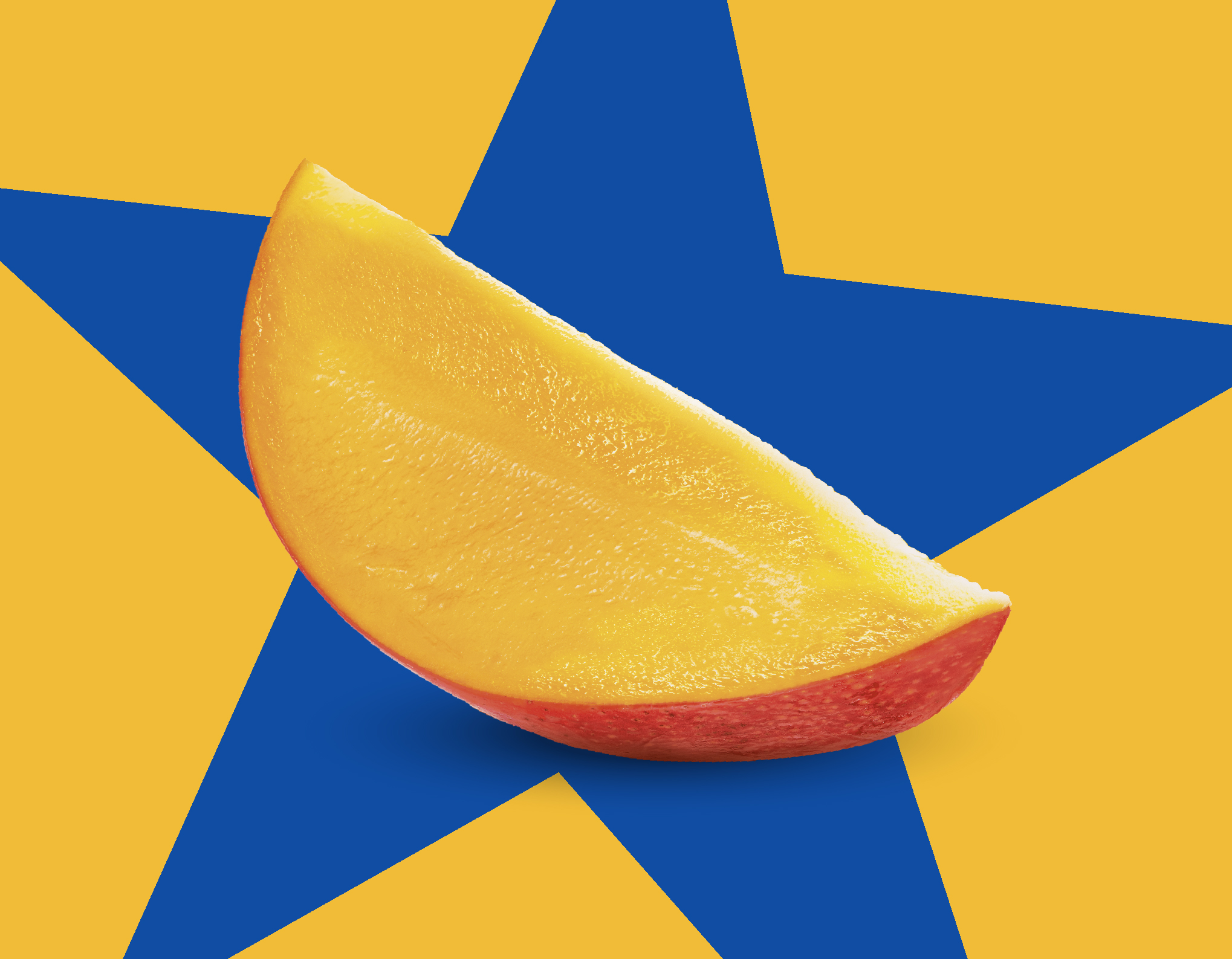
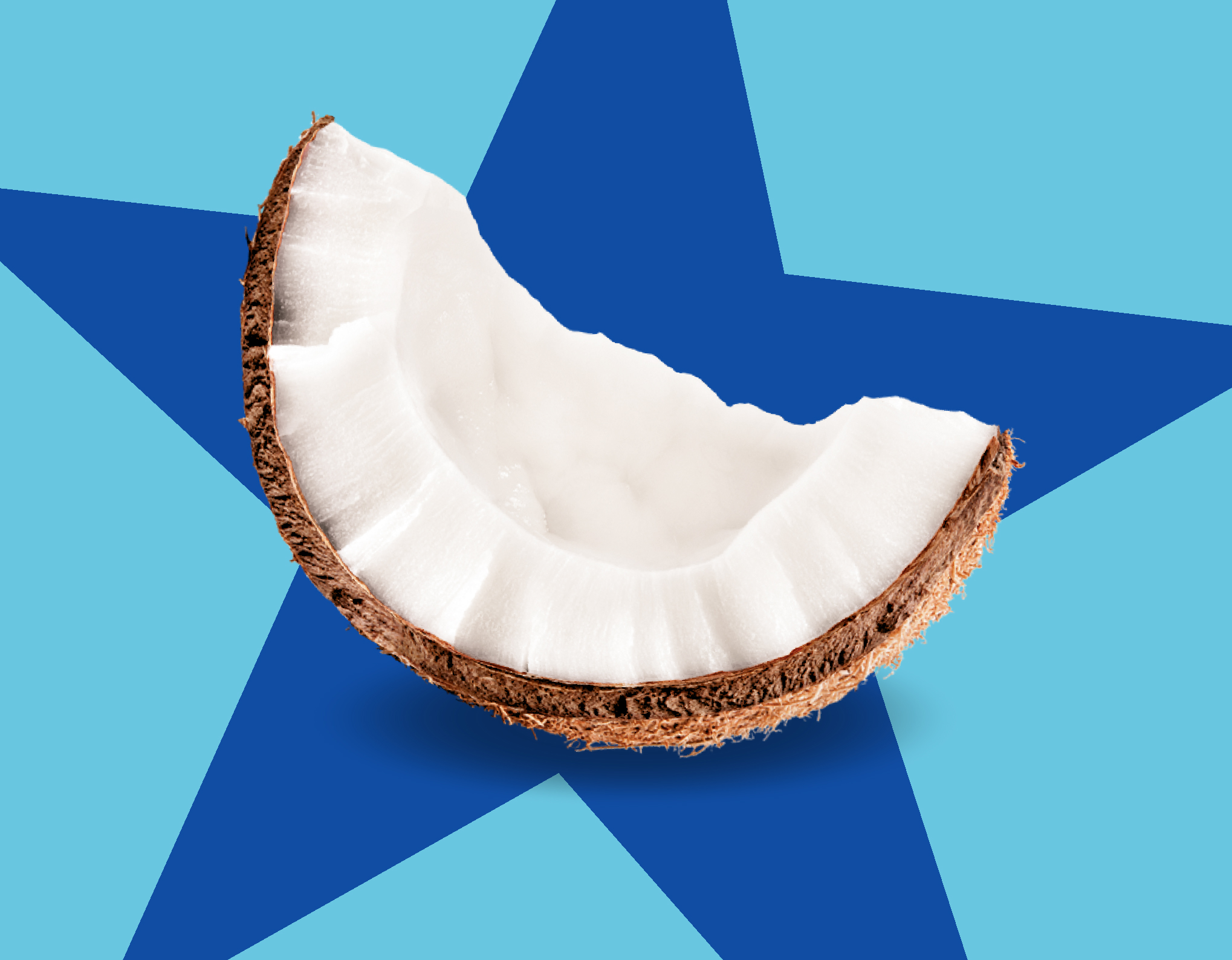
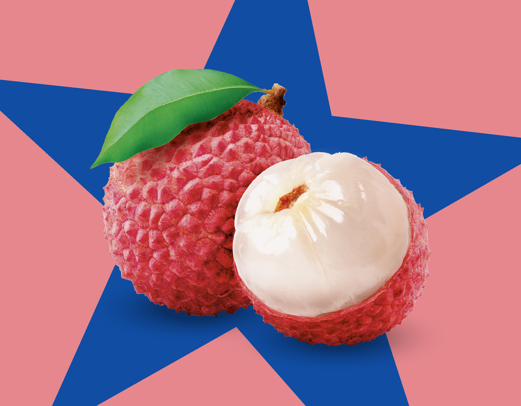
On the brand’s identity level, we aimed for a very symbolic visual identity. We needed an icon that would bring in the magic, and at once present a statement: “here I am!” The star was the perfect symbol. It is very simple, yet we made it irregular and a little diagonal to be more dynamic and unique. The blue is a very visible color and also one traditionally connected to magic.

This concept guided the whole creative job, from brand positioning and naming to visual identity, including logo, packaging design and key visuals.

The name Magico comes from the combination of magic and coconut, it has an Italian sound that communicates the pleasure of being magically taken to a sunny place.

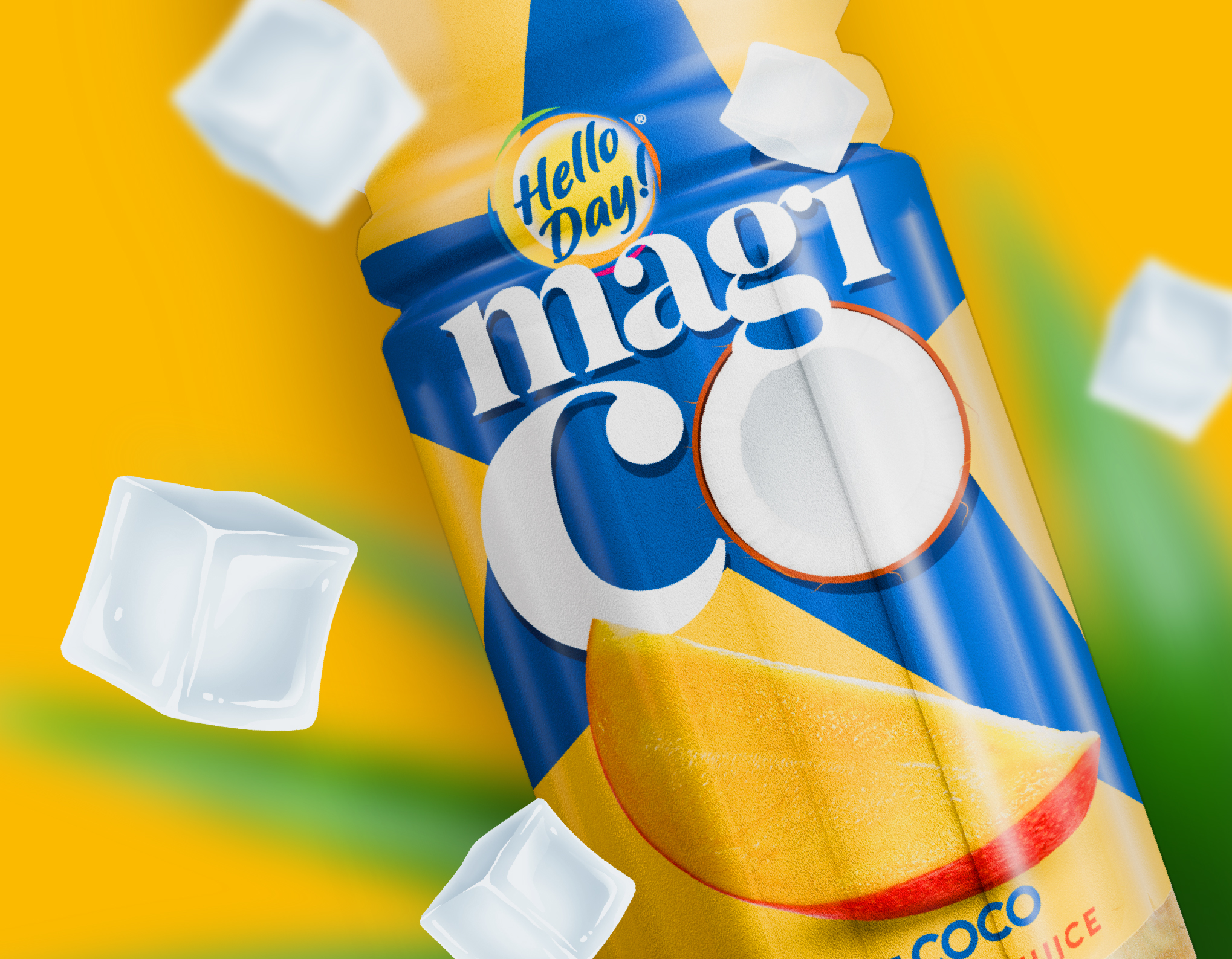
The fruit visuals are hyper-realistic illustrations. This brings in the necessary appetite appeal to the packaging, without overloading the design with further elements (we aimed for maximum clarity).

0