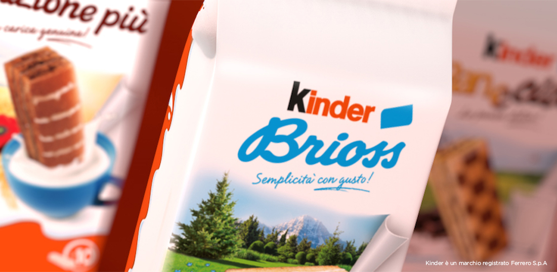
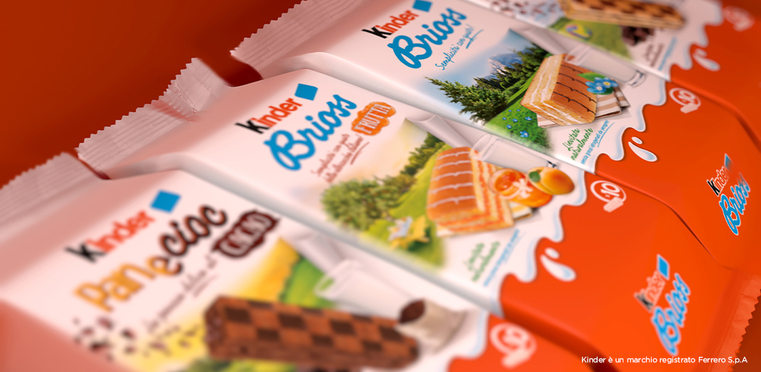
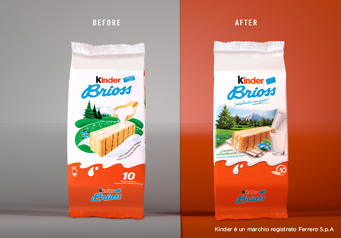
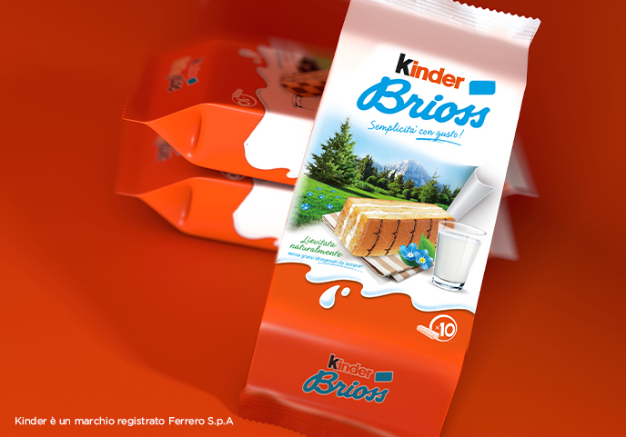
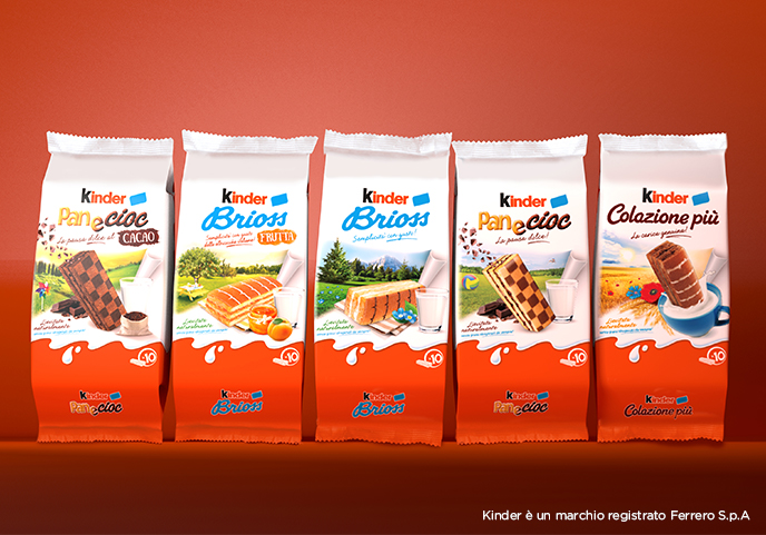
It was necessary tell the strengths of the products (taste, natural leavening, quality milk) in a modern way. Previous packagings used illustrated images to show the products against fairy-tale landscapes. This visual language did not address modern consumers, who are increasingly aware, dynamic and seeking for real information about their food. The first step was to replace illustrations with real pictures, improving the appetizing appeal of the snack. The new, real landscape has now the purpose to tell the story of the product: a strip of paper tears off and shows a natural environment, each time connected to different ingredients (mountains connect to the alp milk in Kinder Brioss, fruit trees to the jam in Kinder Brioss Frutta and a wheat field to the cereals in Kinder Colazione Più).
As Panecioc is the snack that is most easily consumed as a yummy break outside breakfast, it was given a more dynamic take: the product is pictured in a standing position and its landscape include free-time elements such as a ball and a pin-wheel.
The glass of milk is a visual clue that both restates the quality of the ingredients and resonates with the historical slogan of the Kinder brand More milk, less chocolate.
Every product has now its own claim and two new sub brand clearly define Panecioc Cacao and Kinder Brioss Frutta.
