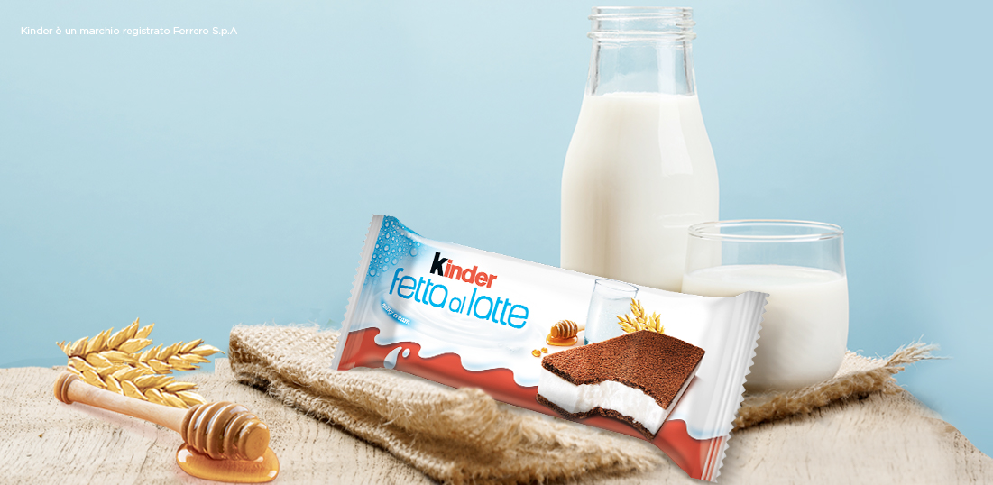
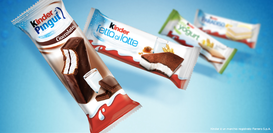
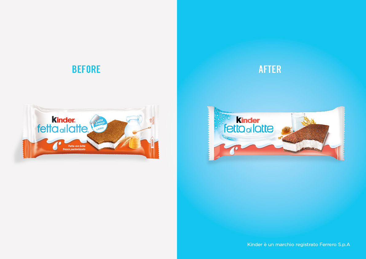
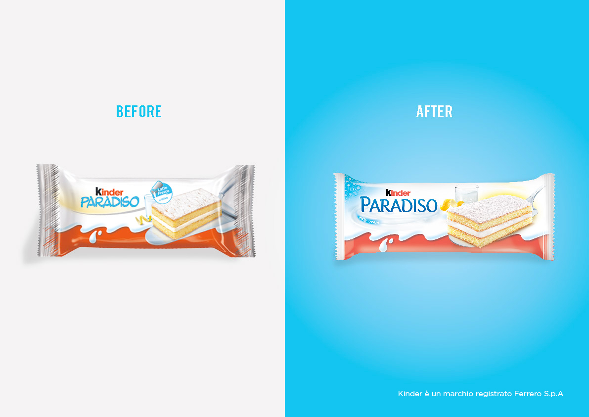
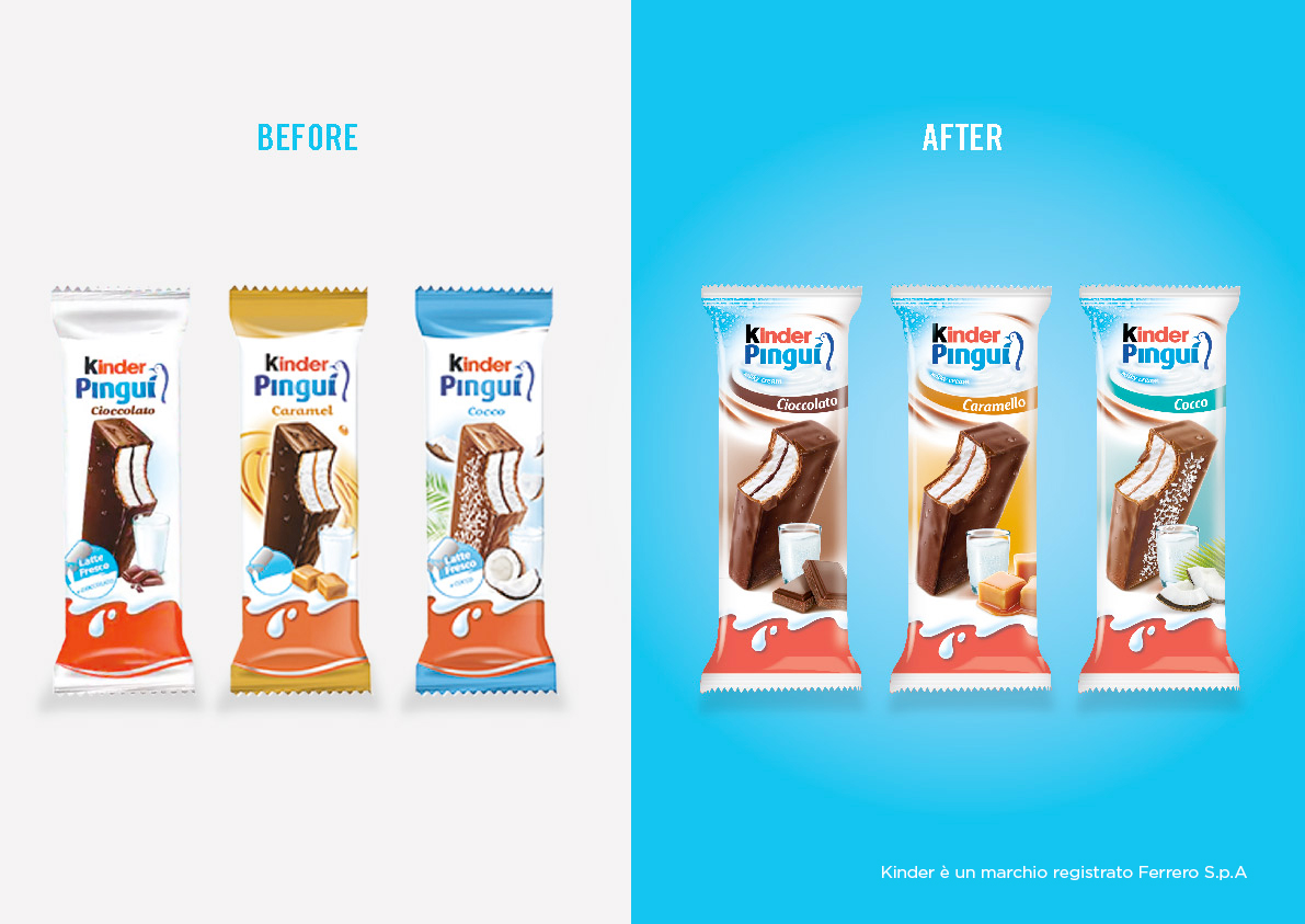
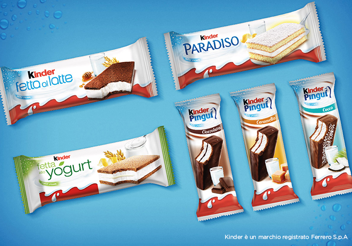
The new system reinforced the proposition of a fresh snack filled with creamy milk by using two graphic devices: a blue area with droplets in the upper left corner communicates freshness (and adds visibility in the white-dominated refrigerated counters), while a milky swirl placed under the sub brand conveys creaminess, supported by the claim Milky Cream.
The main visual of every product was rotated to show the snack from a more appetizing angle and the fonts of each sub brand were changed in order to resonate better with the target of each snack.
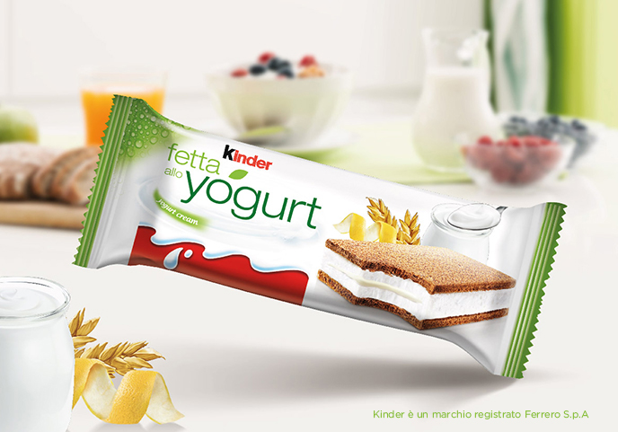
The new system applies also to the new Fetta allo Yogurt with two differences:
– The milky waves (colata di latte), the main Kinder brand identifier, have been resized in order to make it easier for the new adult target to relate to a Kinder snack.
– The differentiating colour is green, reflecting the product ability to address adults and interpret the new food trends with healthy ingredients: sponge cake with cereals, yogurt with live lactic ferments and lemon. All of these have been conveniently illustrated in the main visual.
