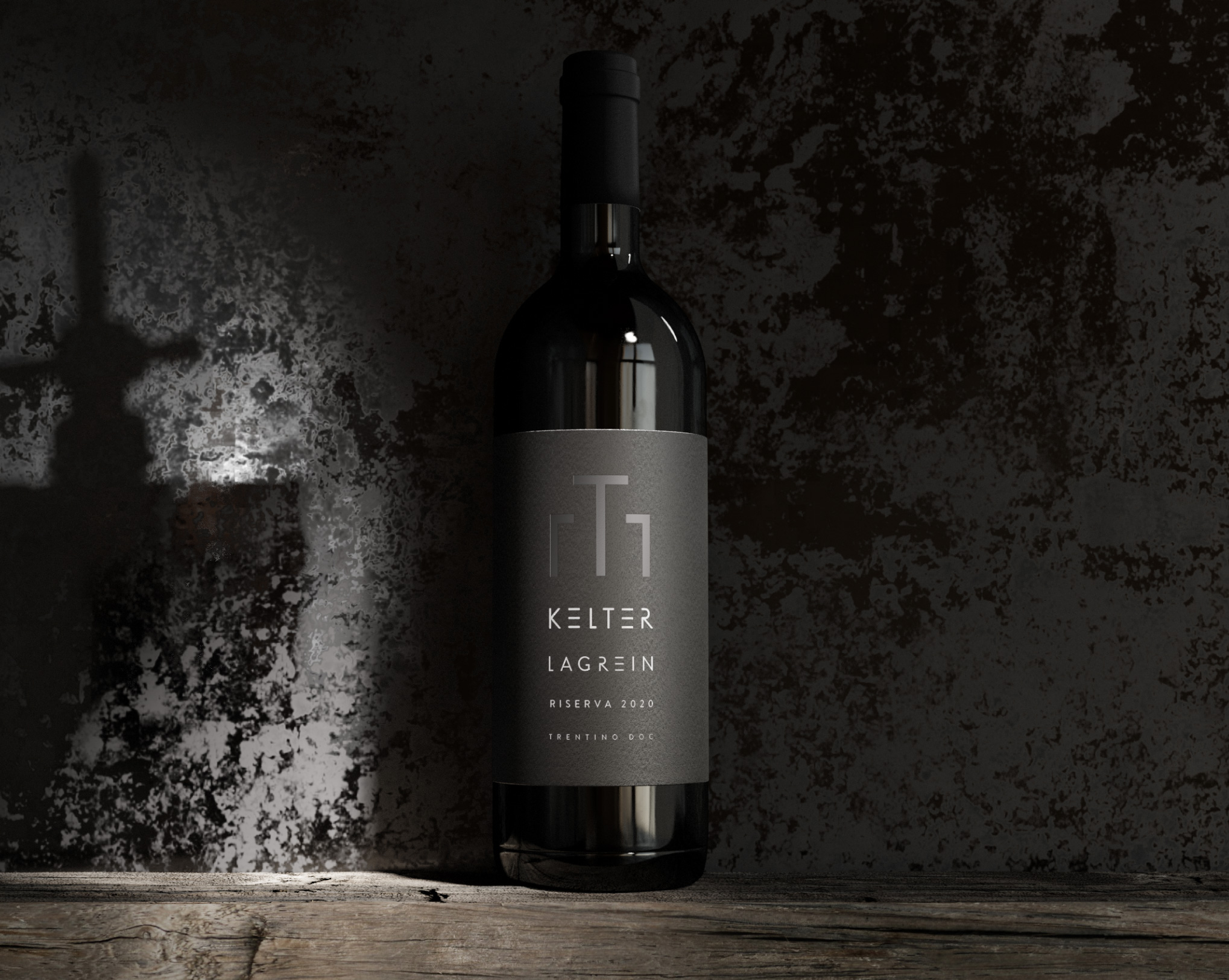
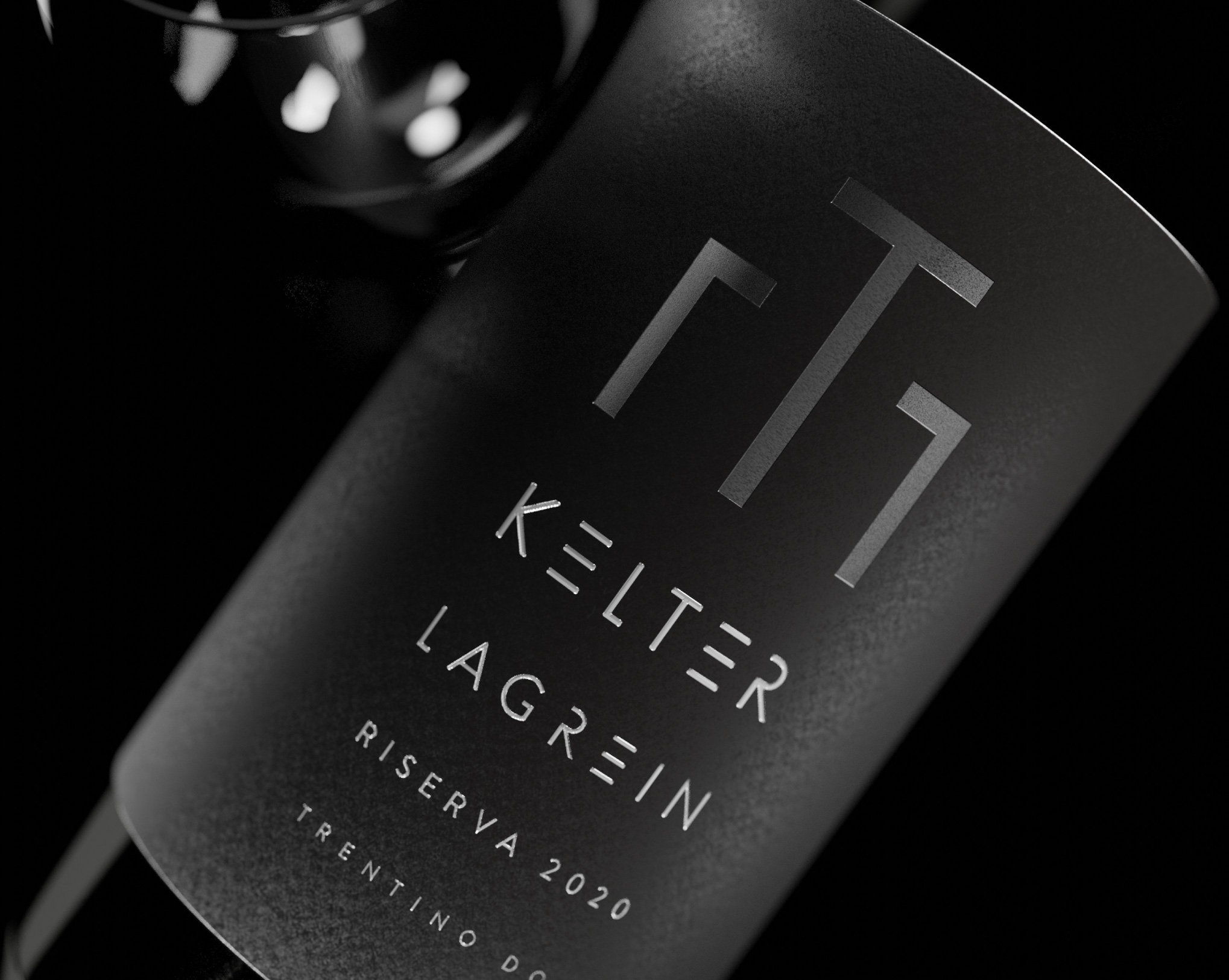
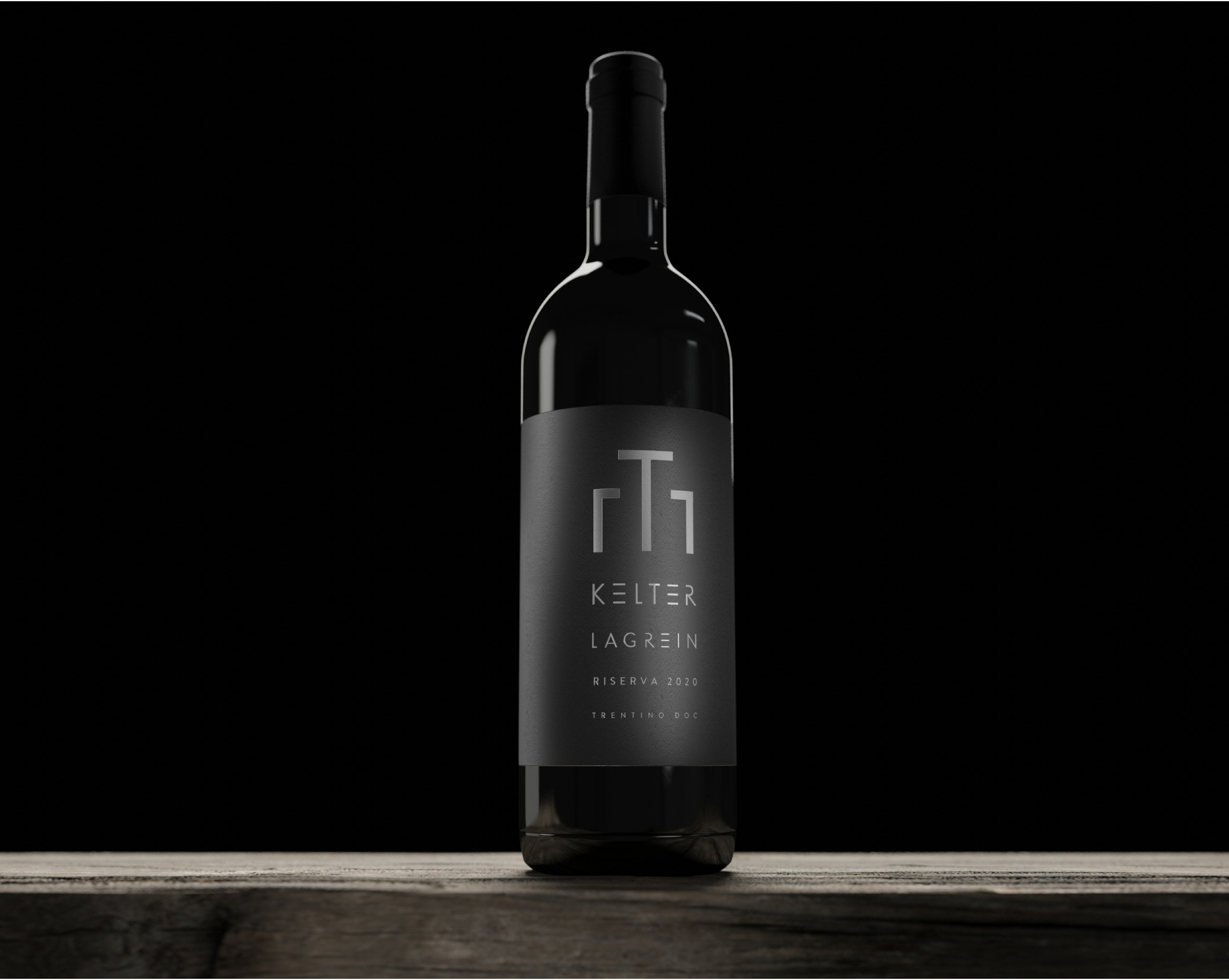
The wine's quality is evident from its name, reflecting a strong territorial identity. In fact, in German, "Kelter" means a wine press, the traditional tool used for pressing grapes. This name evokes tradition and the care that goes into producing great wines.
Break Design has created Kelter's visual identity, developing a highly impactful and elegant image.
The label is clean, with various levels of information elegantly tied together through different fonts and strong spacing. A stylized, dark silver wine press in relief alludes to the name's meaning and creates a highly iconic and recognizable element. "Kelter" and "Lagrein" are written in unique and exclusive characters, all enhanced by an elegant and precious color.
L’effetto complessivo è di un vino Premium che racchiude la migliore espressione dei vitigni legati alla tradizione e alla storia del territorio.


