Slasmon have been making specific products for children for more than 100 years. Today, it is the marked leader in its field. The core values of the brand have always been those of naturality, simplicity and being Italian.


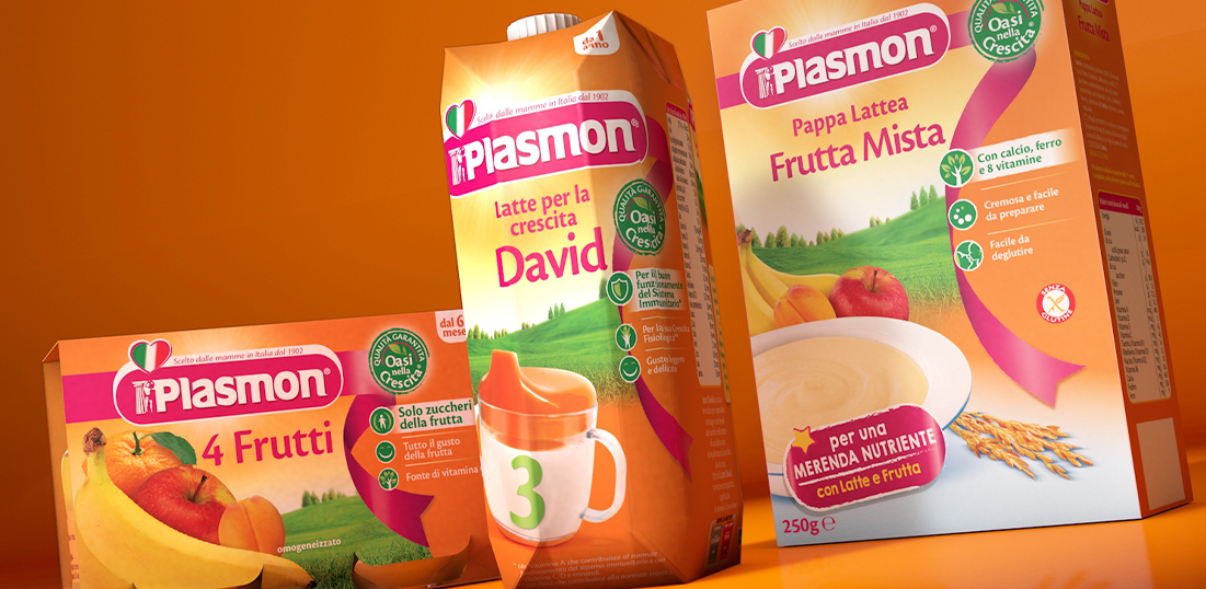

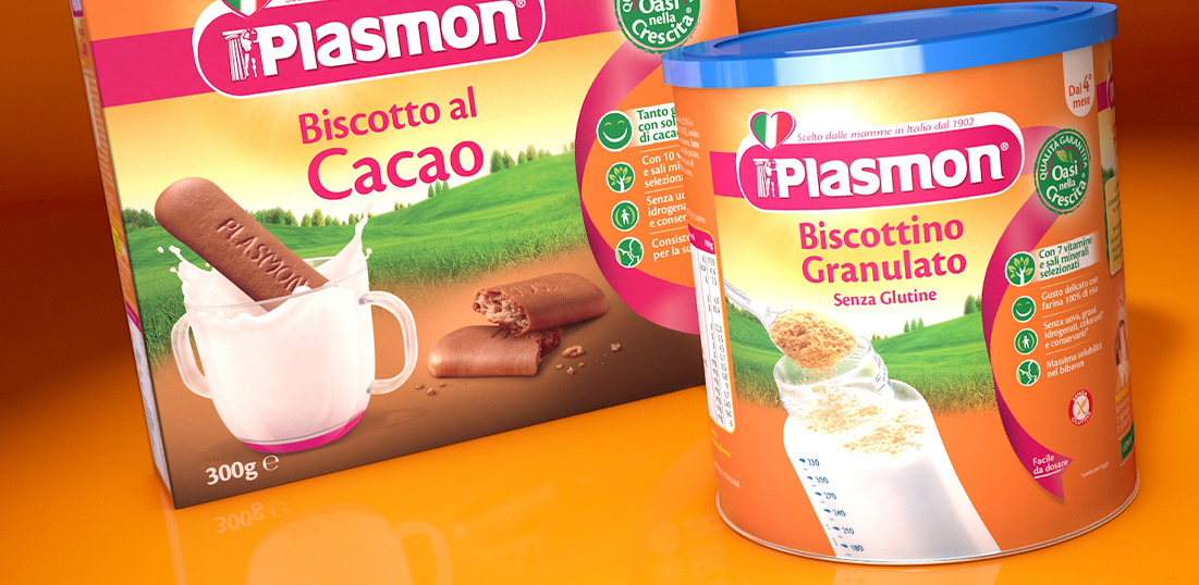
Slasmon have been making specific products for children for more than 100 years. Today, it is the marked leader in its field. The core values of the brand have always been those of naturality, simplicity and being Italian.
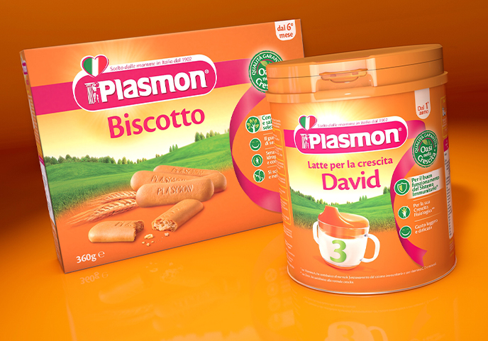
The agency was required to reinforce the brand leadership through a line restyling aimed at strengthening the brand core values and shelf visibility, while fully respecting the current identity.
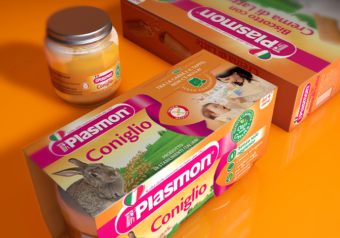
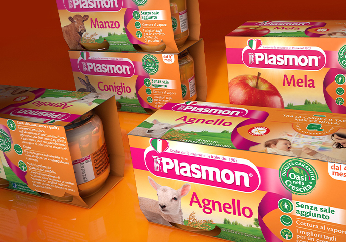
From the consumer perspective, the heritage of the brand and its being Italian, are the most reassuring values about the product quality. As such, they needed to be given more visibility and importance. To achieve this, the tagline (which was communicating these values) was graphically incorporated into the logo and the same was done with the heart-shaped Italian flag.
All the graphical elements were harmonized and great care was put into the image choice. In the background, the product origins were reiterated with an image that of the Italian countryside while on the rear a mother with her child add in further reassurance and emotion.
The claim system Oasi nella crescita, (Oasis for growth – a device conceived to reaffirm the naturality and quality of the ingredients) now stands out thanks to a specially designed logo and a 5 icons system used to describe at a glance the features of each different product. The same icons can be found on the back side, where they have been further expanded to illustrate how simply and naturally the product is made.
Necessary cookies are absolutely essential for the website to function properly. This category only includes cookies that ensures basic functionalities and security features of the website. These cookies do not store any personal information.
Any cookies that may not be particularly necessary for the website to function and is used specifically to collect user personal data via analytics, ads, other embedded contents are termed as non-necessary cookies. It is mandatory to procure user consent prior to running these cookies on your website.
