Aince many years, Rizoma impersonates elegance, luxury and quality in the world of bikes. The main goal is to consolidate and allow the brand for further growth according to its products and its Italian heritage.


Aince many years, Rizoma impersonates elegance, luxury and quality in the world of bikes. The main goal is to consolidate and allow the brand for further growth according to its products and its Italian heritage.

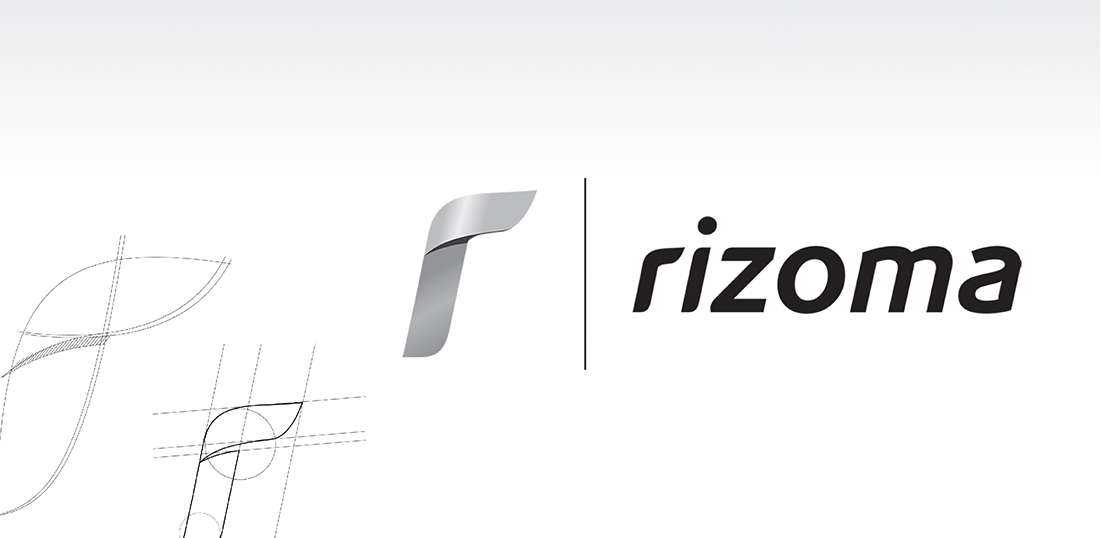
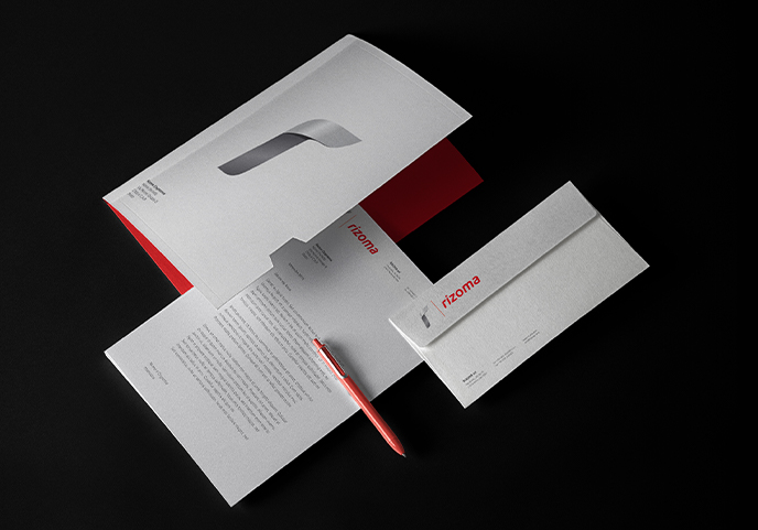
Designing a new logo and brand identity that would stress more effectively the current brand values (such as care for design, quality and aesthetics). Thus creating an identity that would allow for future brand extensions into new market segments.

To make future brand extensions easier, the new Logo looses the red color, an aggressive and mainstream choice in the biker’s world, to pick colors that belong to the design world. A new graphical device is giving a more modern appeal. Its color is the same color of aluminum, which is the most used material in the high quality production of Rizoma.

Necessary cookies are absolutely essential for the website to function properly. This category only includes cookies that ensures basic functionalities and security features of the website. These cookies do not store any personal information.
Any cookies that may not be particularly necessary for the website to function and is used specifically to collect user personal data via analytics, ads, other embedded contents are termed as non-necessary cookies. It is mandatory to procure user consent prior to running these cookies on your website.
