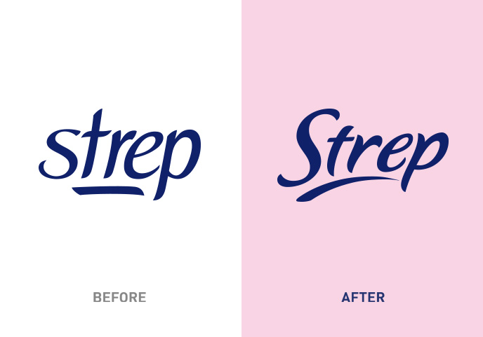
The logo takes on lighter features and is freed from some rigidities, to underline the pleasure of shaving while ensuring visibility that is consistent with the brand’s attributes. The introduction of the capital S gives the name greater incisiveness and authority. The blue color is kept so as to anchor with the past.
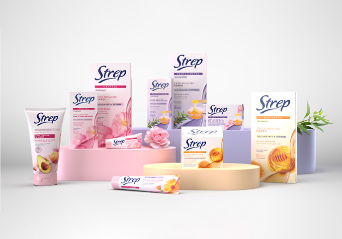
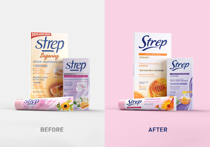
The packaging system becomes more integrated, favoring the traceability of information.
The images relating to the fragrances, brand pluses, are magnified and together with the various soft colors contribute to the differentiation between product lines.
The packs are chromatically less dense: on the one hand to facilitate the logo visibility, on the other to communicate with greater clarity and cleanliness: Strep helps eliminate a problem and you feel clean and perfumy.


