Wuber is not only a brand, but a corporate composed by people and based on a long-life history, and exactly from brand history found its origin the 38 project.
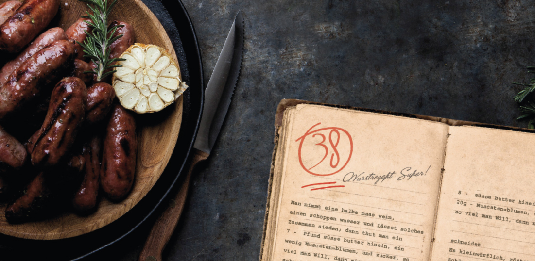
It all began from one of the first masters of Wuber, Hans, who usually wrote on his block notes the Wuber best recipes ever.
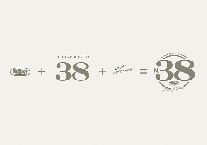
Therefor, page 38 of Hans’s block notes become a symbol, an icon, which is not only a number, but a work method and life style.
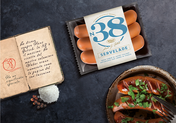
Break developed a visual identity able to spread the concept both on the packaging, and on the entire communicational material of the brand.
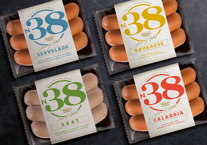
The packaging, which is the first communication material, is dveloped through a shape which strongly valorize the product, showing it, and highlighting a black background on which is placed a paper band conveying the premiumness of the product.
